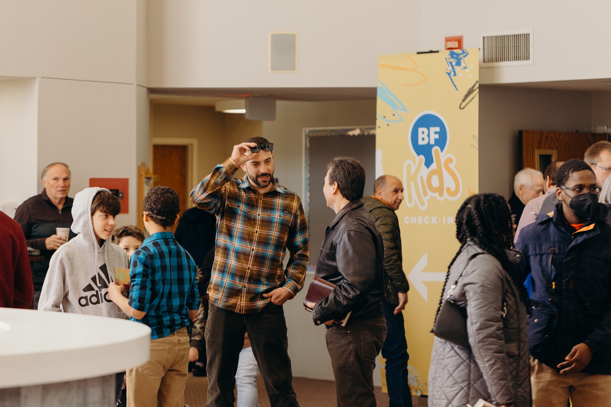
Brookfield First
Designing a unified brand to serve the kingdom.
Project Overview
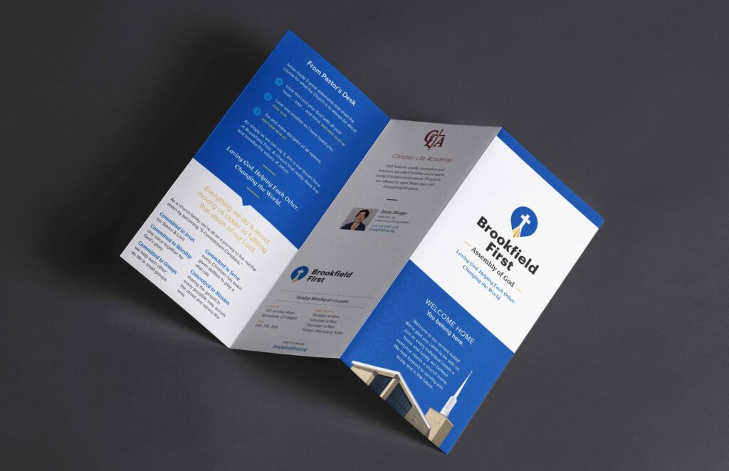
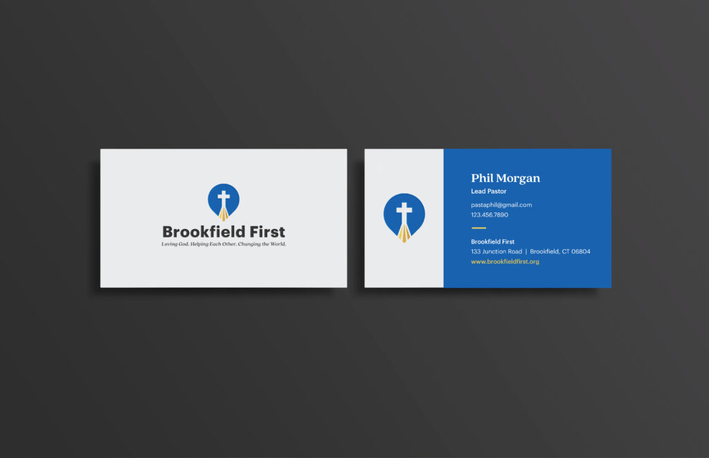
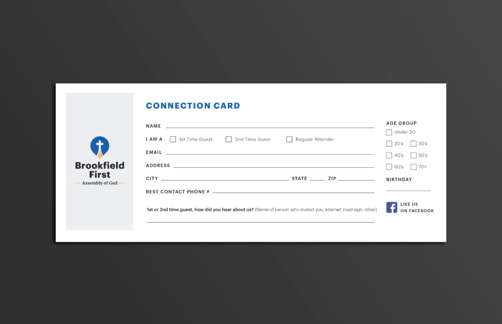
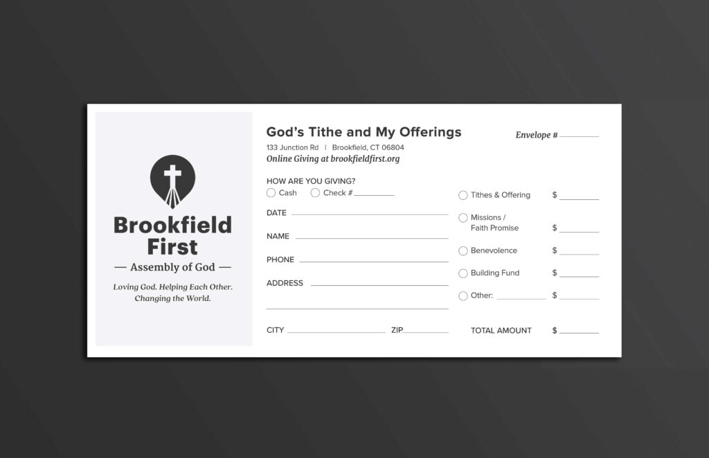
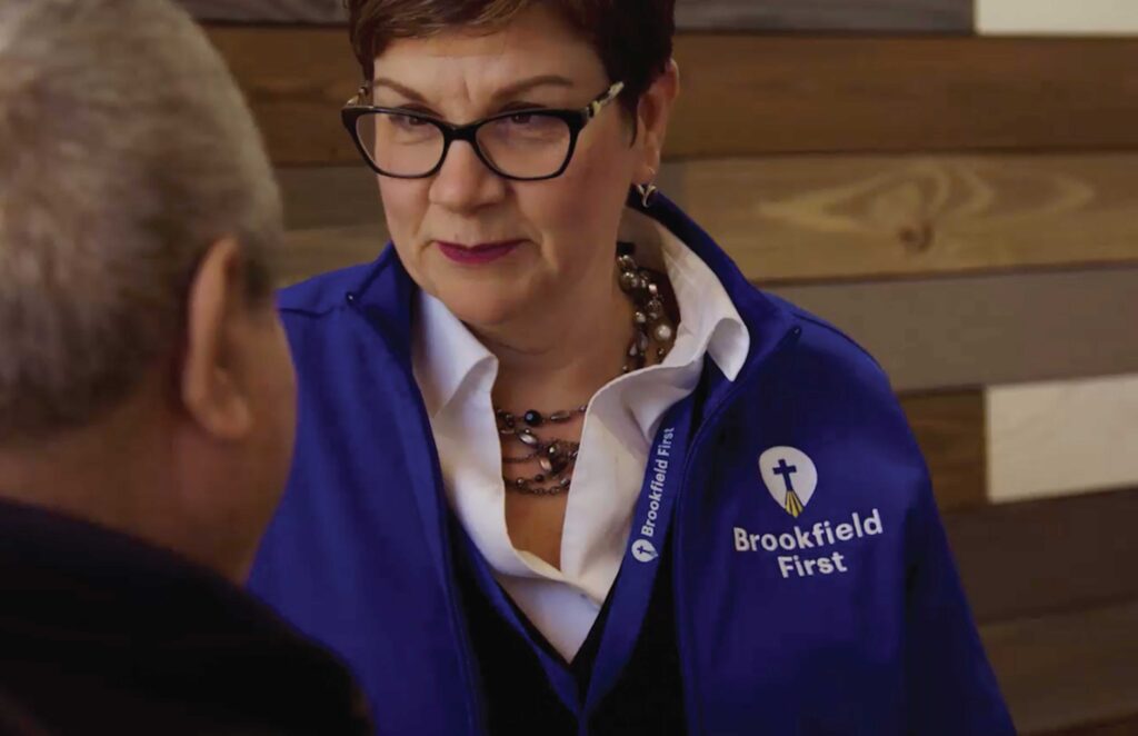
For Brookfield First Assembly of God, I led a full rebranding effort that began with a much-needed logo refresh to modernize and unify their visual identity. Once the new logo was finalized, I extended the branding across all touchpoints, redesigning their print materials to ensure consistency and creating a digital presence by redesigning their website. The updated brand helped the church better communicate its mission and connect with both its congregation and the broader community.
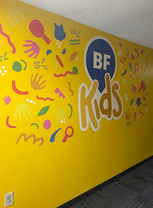
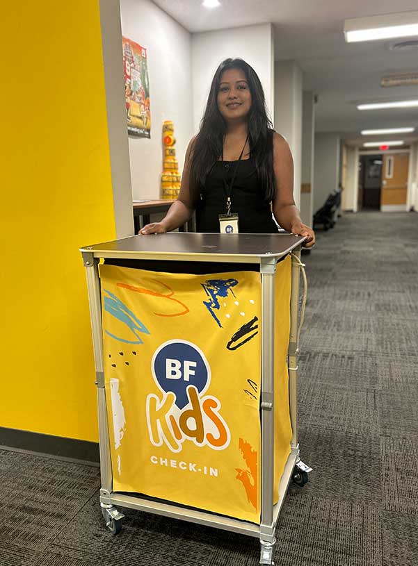
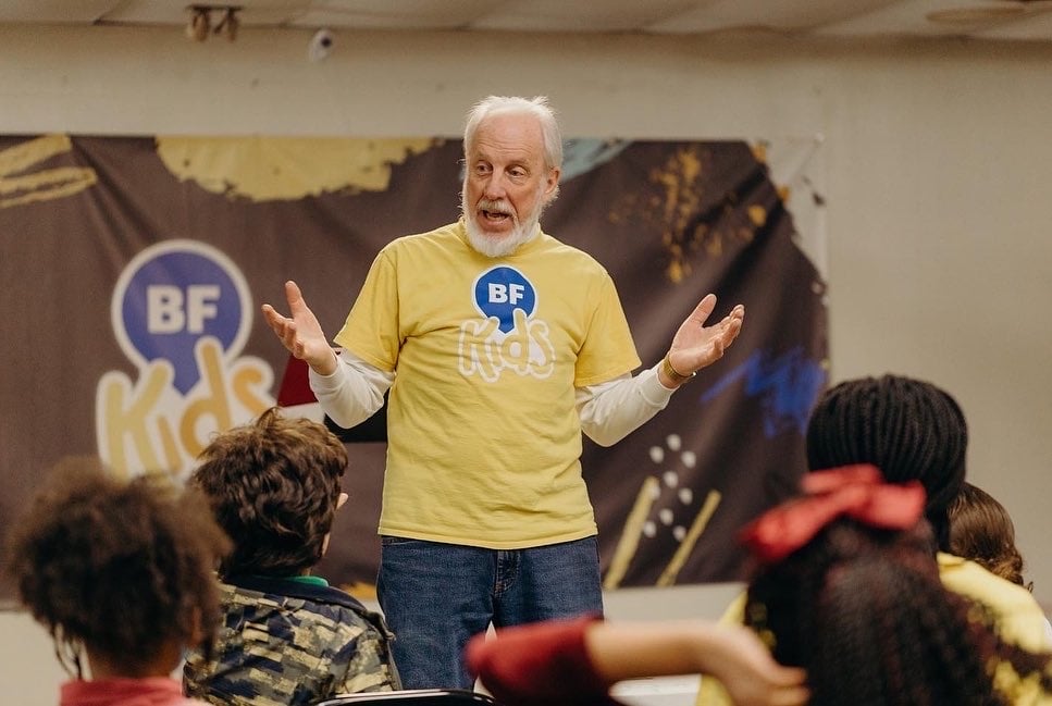
To further support their ministries, I developed a distinct logo for the Kids Ministry that aligned with the overall brand while appealing to younger audiences. The refreshed branding was also applied to merchandise such as mugs, t-shirts, and other products, giving members tangible ways to engage with and represent their church. This holistic approach ensured the new identity felt cohesive, versatile, and welcoming across every platform.
IN COLLABORATION WITH
MY ROLE
Challenge
The biggest challenge in rebranding was untangling years of inconsistent logo use across the church’s materials. The existing logo appeared in different colors, sizes, and even naming variations, which diluted the brand’s recognition and impact. At smaller sizes it became illegible, and there was no cohesive identity system in place for individual ministries, making it difficult to maintain a unified visual presence.
Beyond these practical issues, the design itself felt outdated and didn’t reflect the church’s vibrant and welcoming character. The rebrand needed to strike a balance: creating a modern, scalable look that could adapt across print, digital, and merchandise, while also establishing a consistent, approachable identity that carried prominence in the community and resonated with both current and future members.
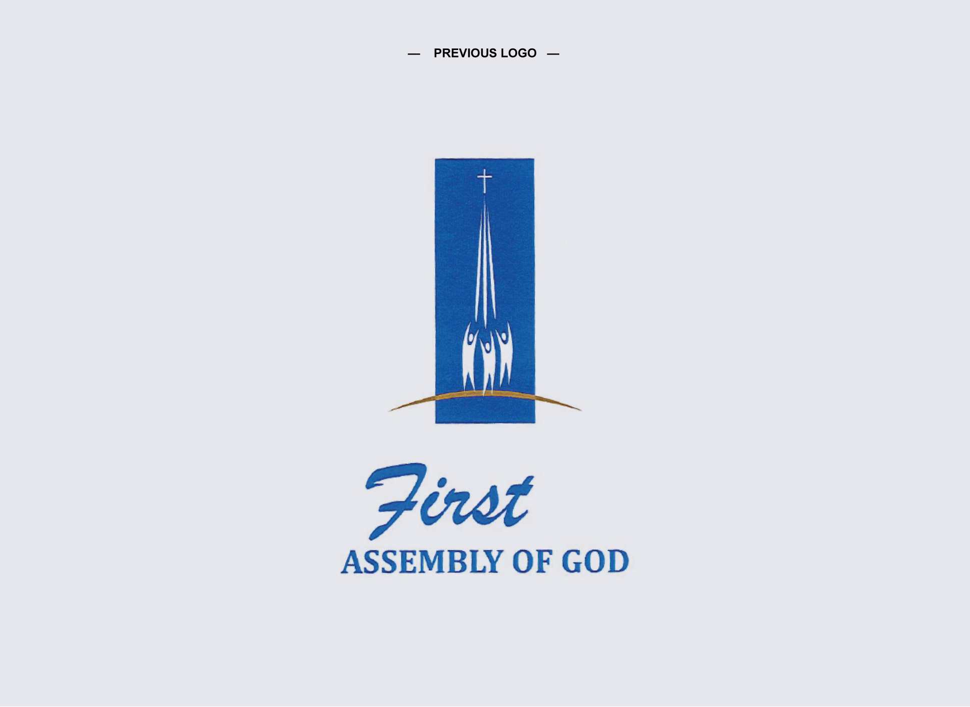
Rebrand
The next steps involved a collaborative brand exercise with the lead pastor to better understand his strategy, positioning, and long-term vision for the church. This conversation was essential in aligning the visual direction with the church’s mission and values, ensuring the rebrand felt authentic and purposeful. From there, I developed and presented three logo concepts, each offering a refreshed, modern design while maintaining a subtle nod to the existing logo with colors, the cross, and radiating lines.
This approach honored the church’s history and familiarity while opening the door to a more cohesive and future-ready identity. A final direction was chosen resonated strongly with the pastoral team and the congregation, honoring the church’s history while establishing a scalable, cohesive identity for ministries, print materials, merchandise, and digital presence.

Kids’ Ministry Branding

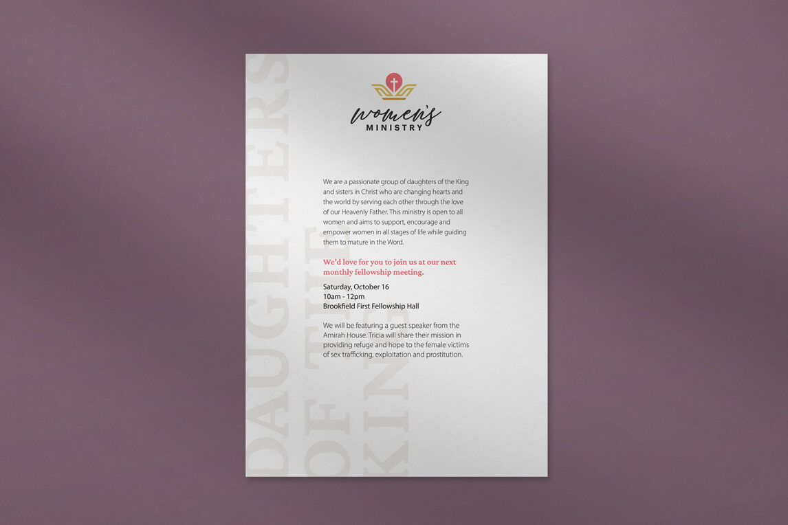
Womens’ Ministry Branding

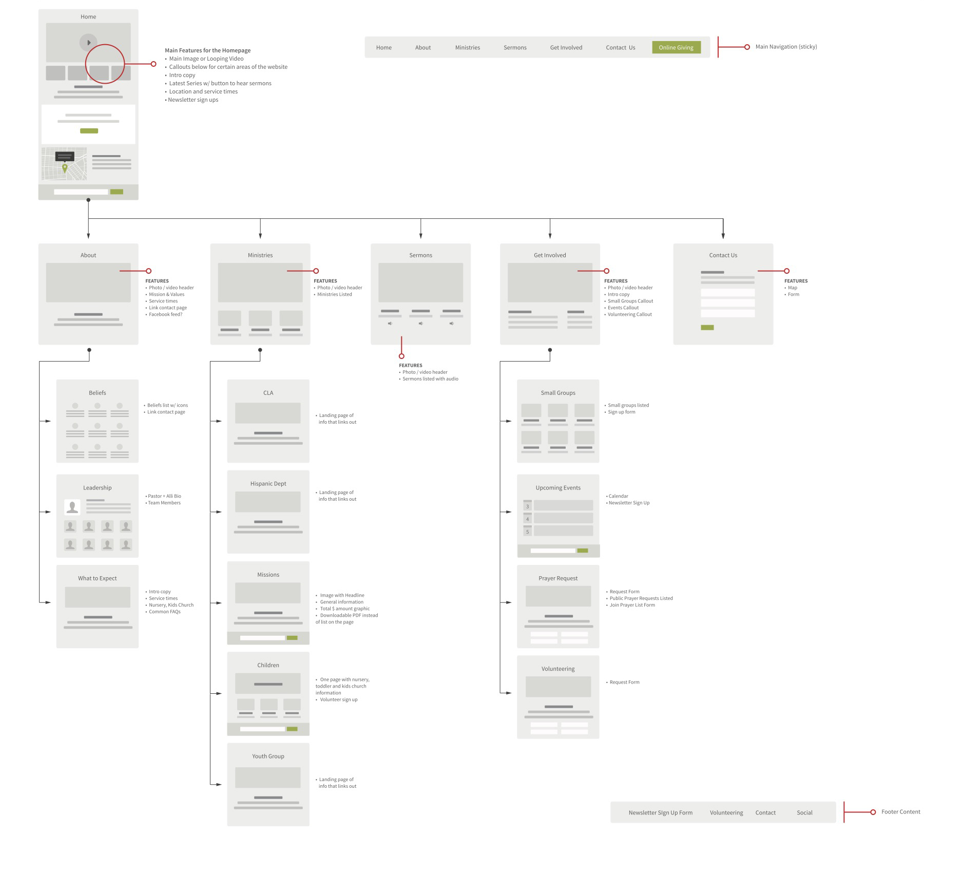
Sitemap
Following the brand development, I conducted a UX audit of the church’s existing website to identify gaps and opportunities for improvement. Based on the church’s outreach strategy, I created a revised sitemap that prioritized clarity, accessibility, and ease of navigation for both visitors and members.
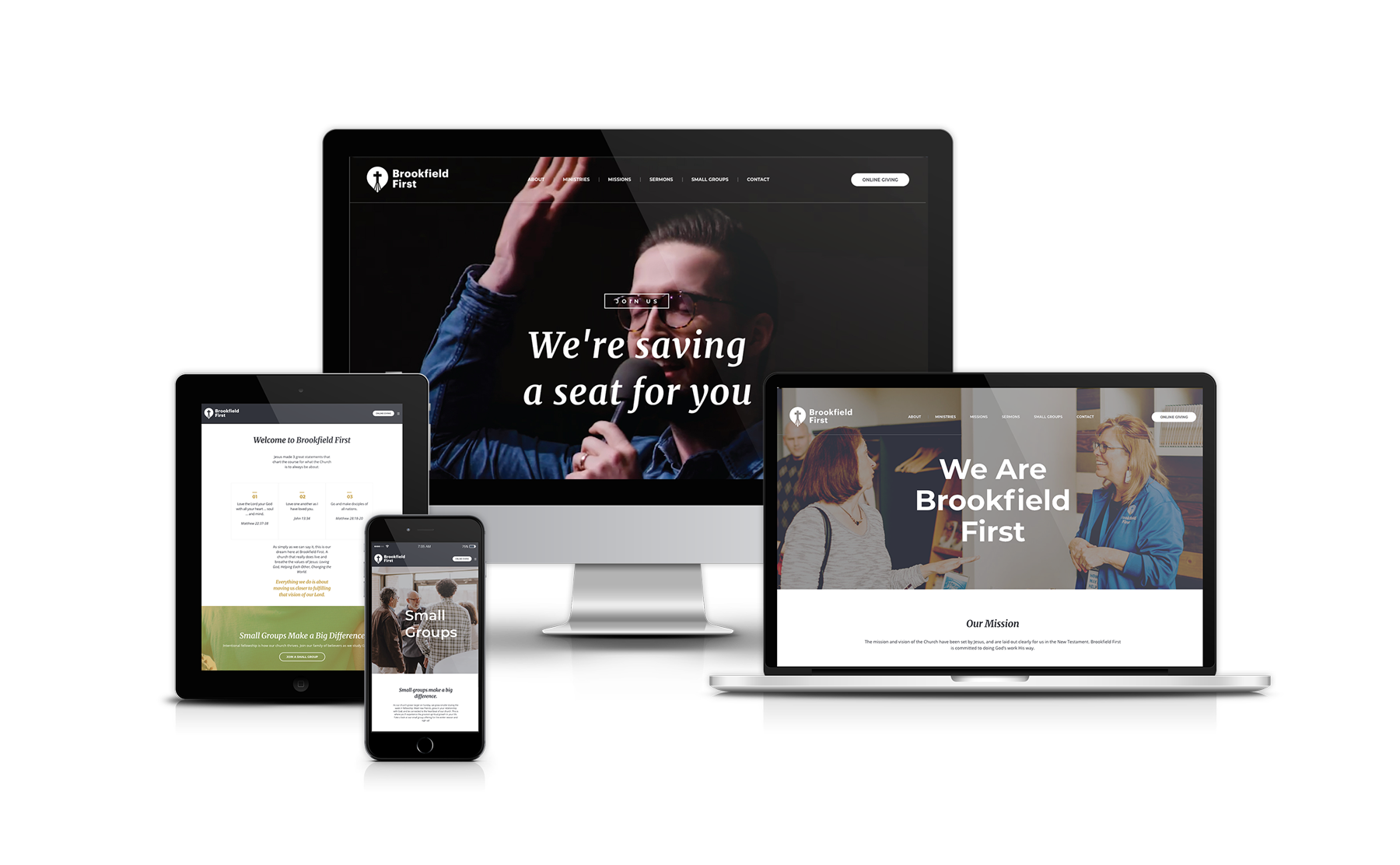
Website
With the structure in place, I designed and built the new site using a relevant WordPress theme, ensuring the visual identity carried seamlessly across the digital experience. To bring the homepage to life, I collaborated with a videographer who was also a member of the church, providing art direction to shape my vision for a looping video that would immediately convey warmth, energy, and community connection.
The result was a modern, user-friendly website that supports the church’s mission and provides an inviting entry point for the community.
Freelance by design.
Collaborative by nature.
Bonfire Creative, LLC. © 2025
