Keep Home
Empowering first-time homebuyers through purposeful design.
Project Overview
Framework®, a Boston-based social enterprise, is committed to narrowing the wealth gap by making homeownership more accessible. They developed the Keep Home app, which equips first-time homebuyers with the knowledge, tools, and resources they need to navigate the path to homeownership with confidence. I was hired by Framework® to create the Keep Home website, which introduced this integrated web and mobile platform.
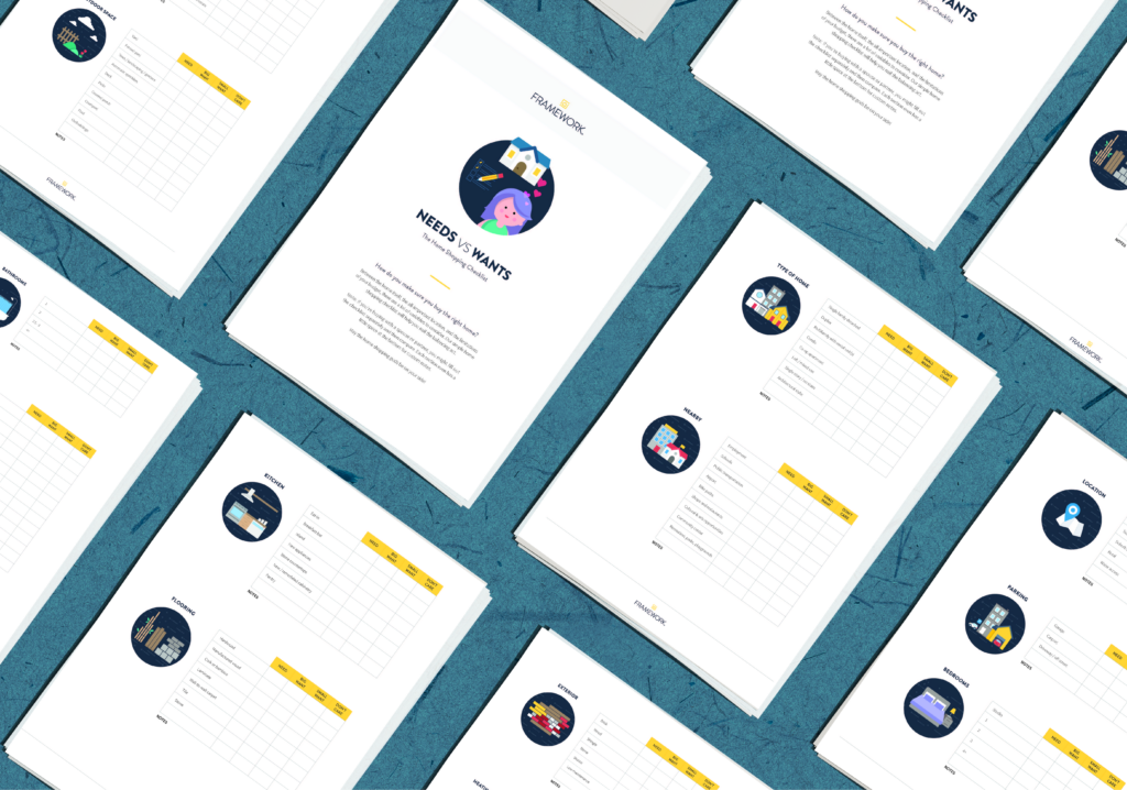
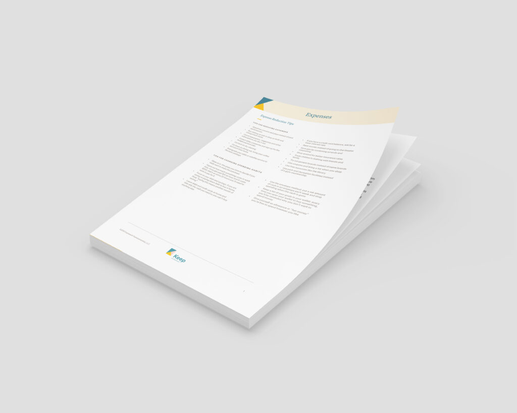
I worked closely with the development team at Agency Labs to create a system of custom Gutenberg blocks for the site and to ensure a templated structure was developed for scalability. Lastly, I was tasked with designing printed collateral, including checklists and tooltips, to improve the user experience and ensure consistency across touchpoints.
IN COLLABORATION WITH
MY ROLE
Sitemap
For the Keep Home project, I collaborated with the client to develop a sitemap that highlighted the unique value of the Keep Home app while keeping the user journey clear and intuitive. The top-level navigation was structured around the three core phases of homeownership—looking, buying, and owning.
To ensure the app remained the centerpiece of the experience, a prominent sign-up button for the Keep Home app was placed in a fixed position, making downloads a consistent and accessible call to action throughout the site.
Wireframes
I collaborated closely with developers from Agency Labs to ensure seamless alignment between design and development. Because the site was being built in WordPress using Gutenberg, I structured the wireframes to clearly define the custom blocks required for each page layout.
Each wireframe included detailed notes mapping block references back to a master library, and identified which pages in the sitemap would use each layout. In total, 13 templates were developed using 24 reusable blocks.
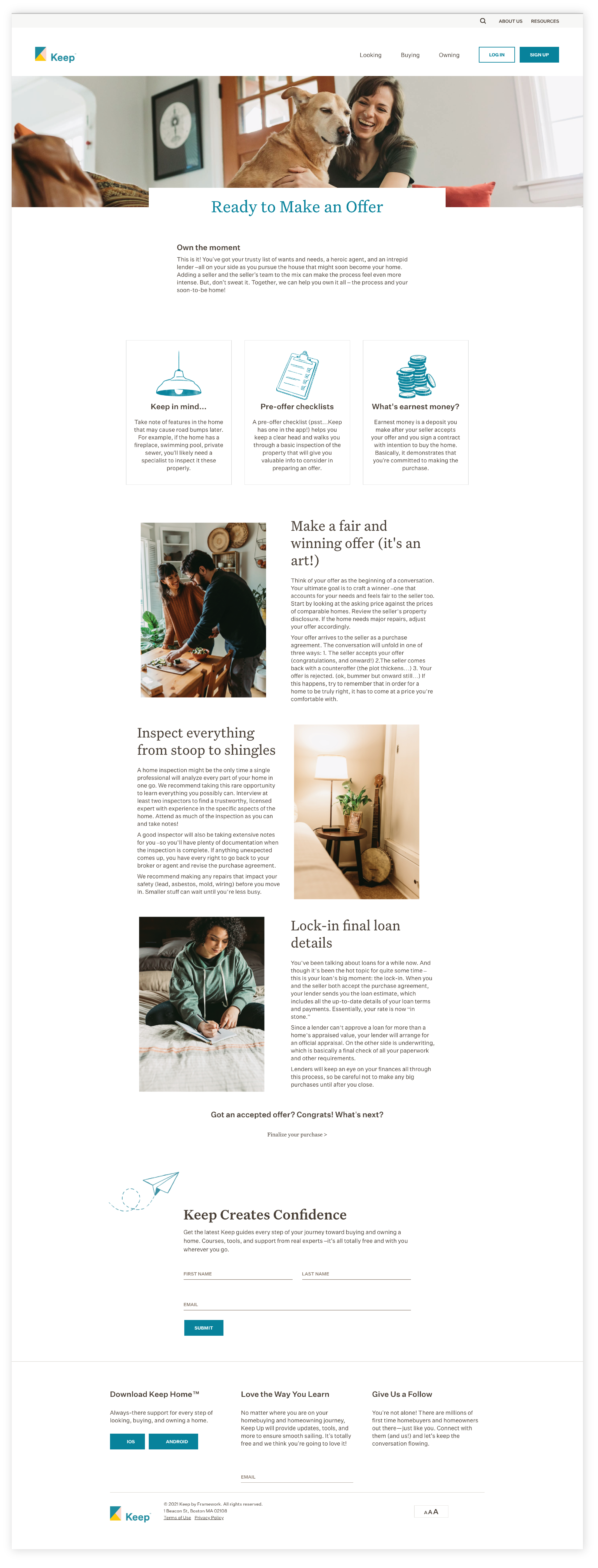
Design
The design came to life by building on the existing brand foundation and introducing layering and overlapping elements that added depth and energy. Diagonal blocks of color guided the user’s eye down the page, creating a sense of movement and focus as the storytelling unfolded.
To further elevate the experience, we incorporated the client’s beautiful photography and illustrations throughout the site, weaving them into the design to create a cohesive and engaging visual narrative. The site was also designed to be fully responsive, ensuring a seamless experience across desktop, tablet, and mobile devices.
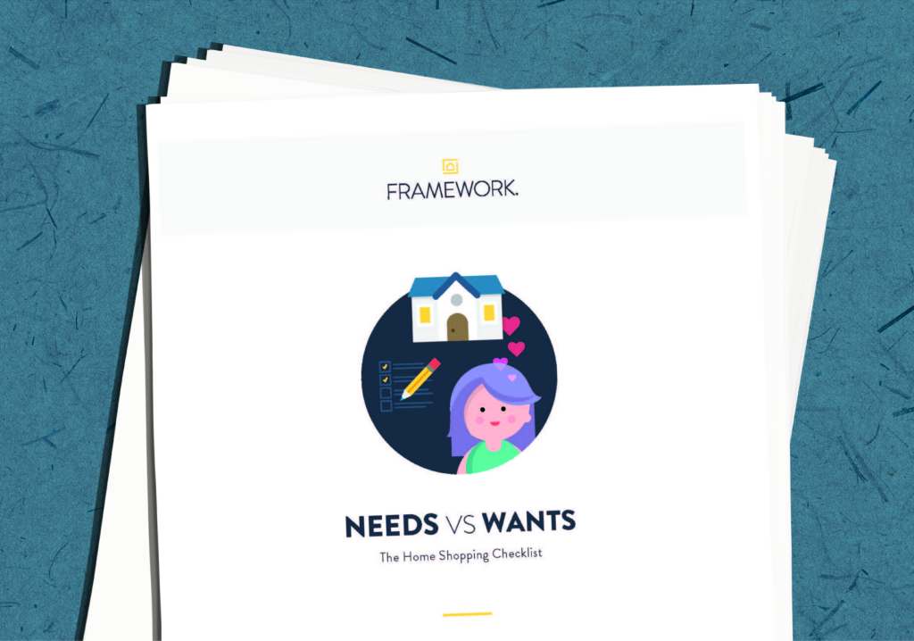
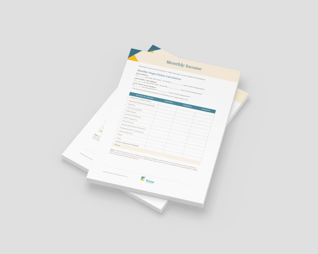
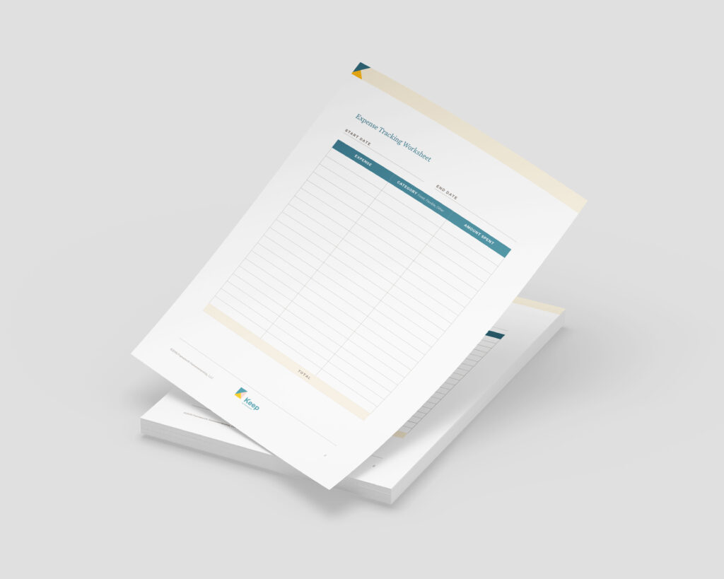
Print Collateral
The design came to life by building on the existing brand foundation and introducing layering and overlapping elements that added depth and energy. Diagonal blocks of color guided the user’s eye down the page, creating a sense of movement and focus as the storytelling unfolded.
To further elevate the experience, we incorporated the client’s photography and illustrations throughout the site, weaving them into the design to create a cohesive and engaging visual narrative. The site was also designed to be fully responsive, ensuring a seamless experience across desktop, tablet, and mobile devices.
Freelance by design.
Collaborative by nature.
Bonfire Creative, LLC. © 2025