Safe Kids Thrive
A website that protects what matters most
Project Overview
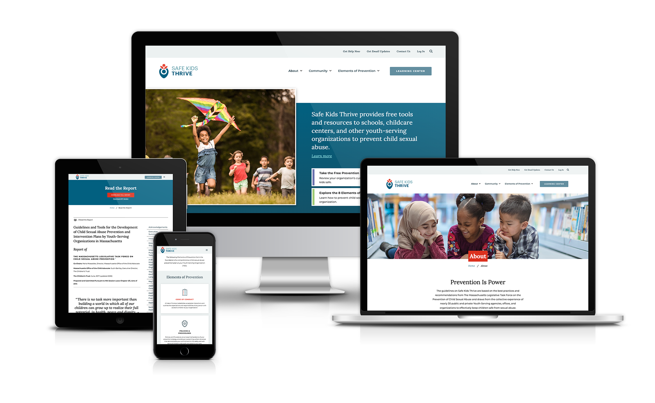
Safe Kids Thrive is a digital platform created to equip youth-serving organizations with the tools, training, and resources needed to prevent child sexual abuse. Commissioned by Children’s Trust, the project’s goal was to take a dense, 200+ page prevention report and translate it into an engaging, accessible, and actionable online experience.
Through a five-phase process—discovery, user experience, design, development, and deployment—the website was built on a custom WordPress theme with features such as a personalized Wizard, interactive toolkits, community events calendar, and integrations with Mailchimp and analytics tracking. By simplifying complex information into user-friendly modules, Safe Kids Thrive empowers organizations to move from information to action, ultimately creating safer environments for children.
IN COLLABORATION WITH
MY ROLE
Sitemap
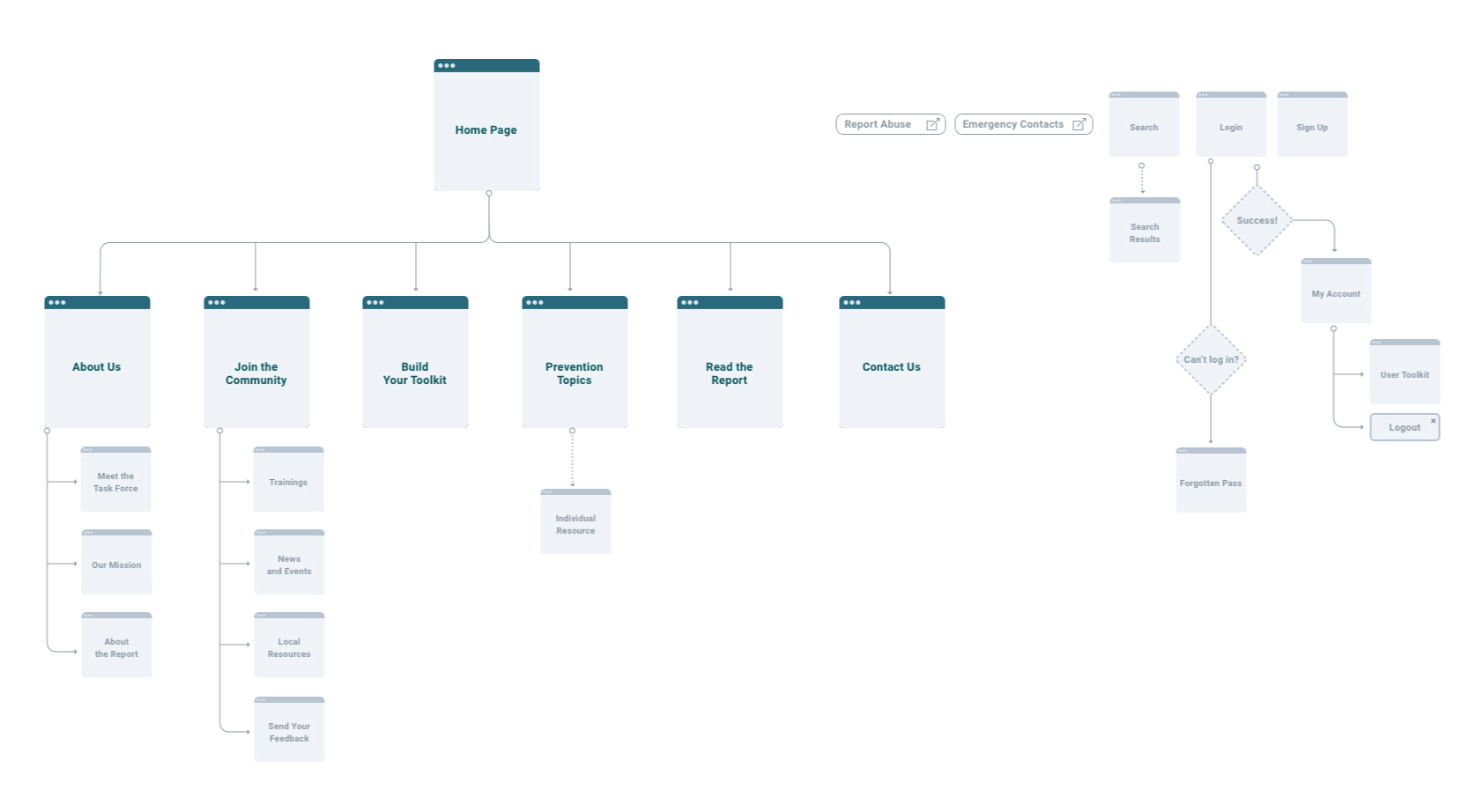
Since Safe Kids Thrive was a brand new website, I began by reviewing all existing content alongside Zamawa Arenas (Flowetik) and Daniel Quinn to ensure alignment with the proposed strategy and goals. Together, we worked through the report’s content, identifying what needed to be rewritten, reorganized, or modularized for the digital platform. From there, I developed a comprehensive sitemap that translated the strategic priorities into a clear information architecture, setting the foundation for the wireframing and design phases.
Wireframes
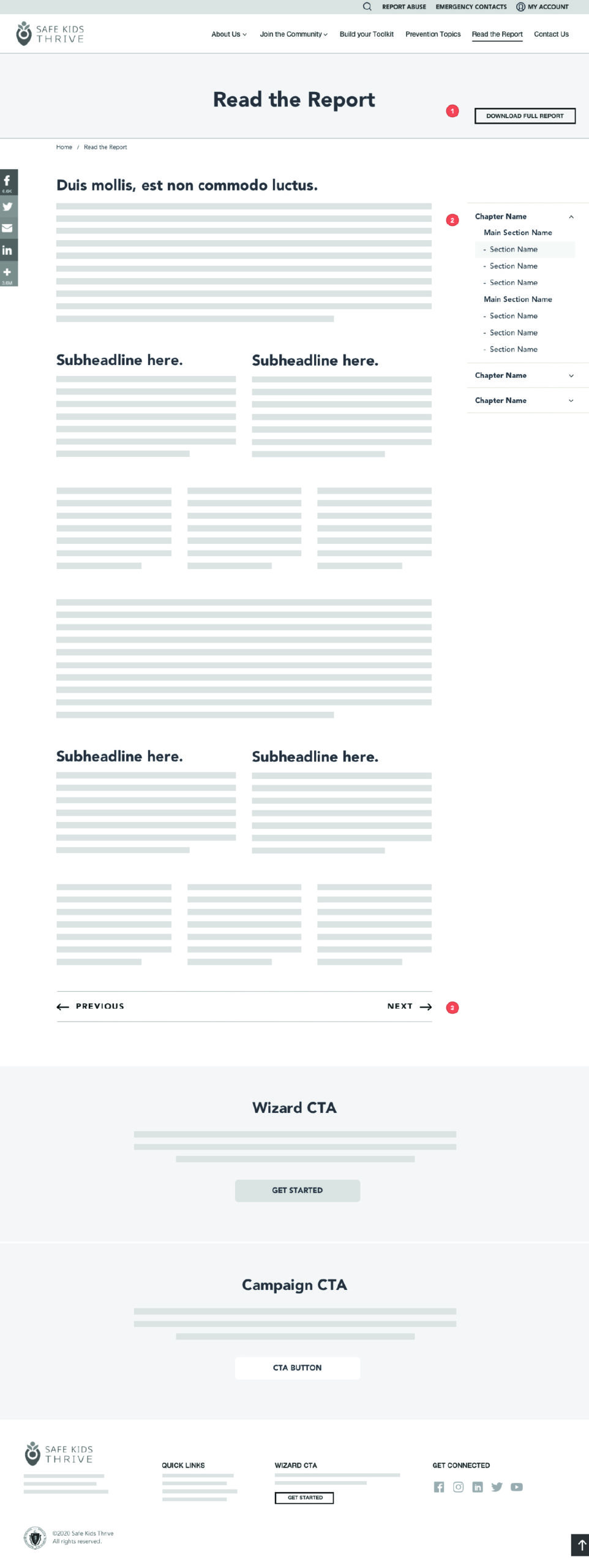
Once the sitemap was finalized, I translated the strategy into wireframes—the blueprint of the site. For me, this is one of the most important phases because it’s where the content, strategy, and user needs begin to take shape visually.
I focused on how different audiences would move through the site: a first-time visitor exploring resources, a youth-serving organization completing the Wizard, or a member returning to their personalized Toolkit. Each wireframe helped answer questions like “What’s the clearest path forward here?” and “How do we keep a complex report from feeling overwhelming?”
Through several iterations and review sessions with the Task Force team, I refined the layouts to balance clarity with flexibility. By the end of this phase, we had a set of wireframes that not only mapped out the site’s structure, but also gave the team a tangible sense of how their vision was coming to life.


Design
Once the sitemap was finalized, I translated the strategy into wireframes—the blueprint of the site. For me, this is one of the With the wireframes approved, I shifted focus to visual design. The Safe Kids Thrive initiative already had a logo and established brand colors, so my role was to extend that identity into a digital space. I wanted the website to feel both professional and approachable—serious enough to reflect the weight of the subject matter, but warm and inviting to encourage engagement.
To start, I created a series of moodboards that explored different directions for typography, imagery, and overall tone. We landed on the direction that best balanced trust, clarity, and accessibility. This art direction then guided the full set of designs, ensuring consistency across templates while keeping the user experience at the center.
Wizard
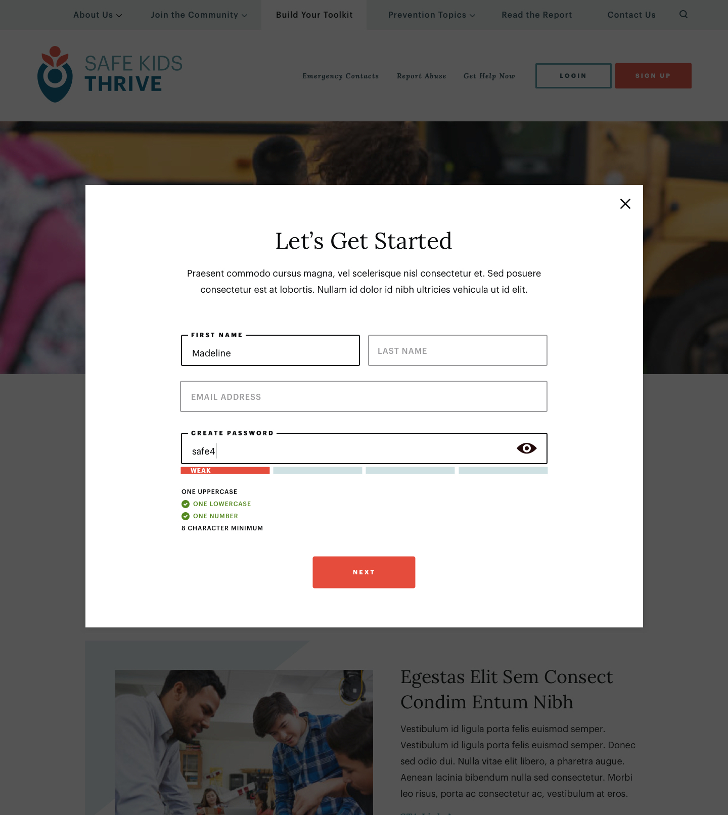
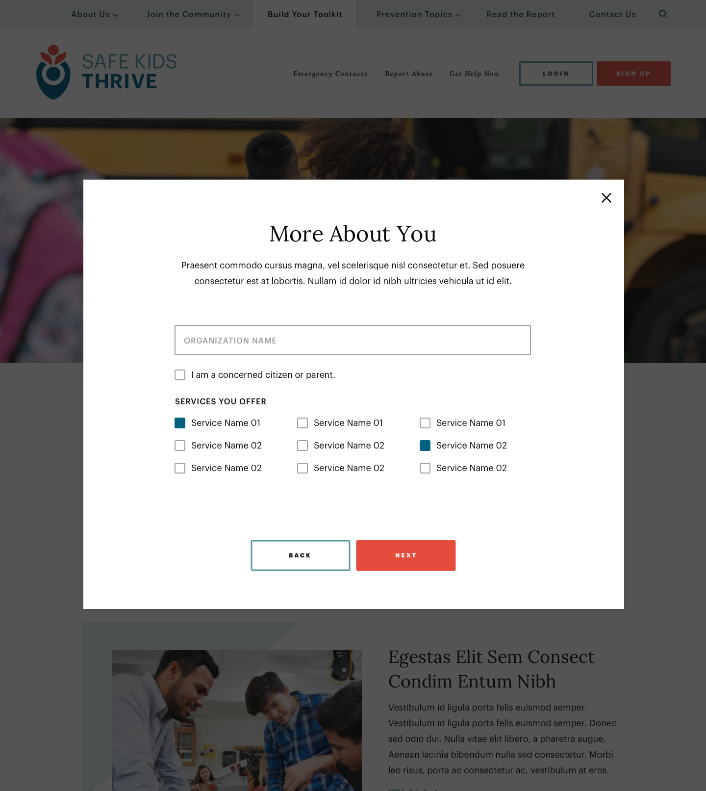
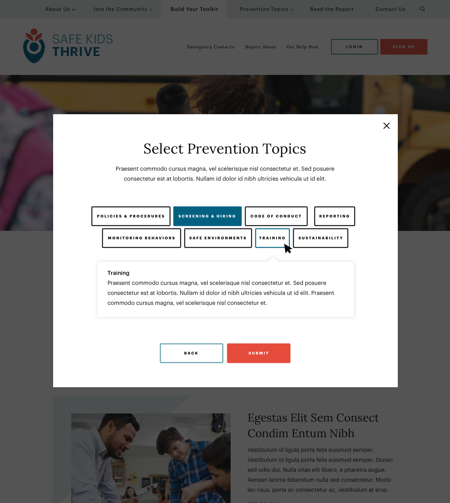
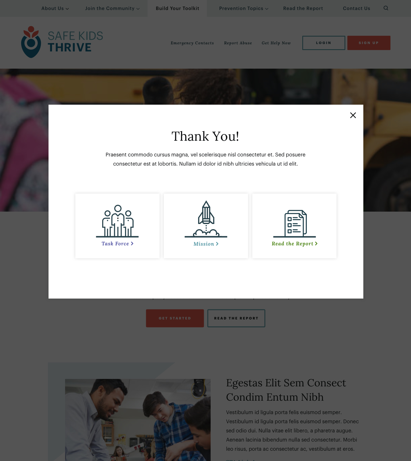
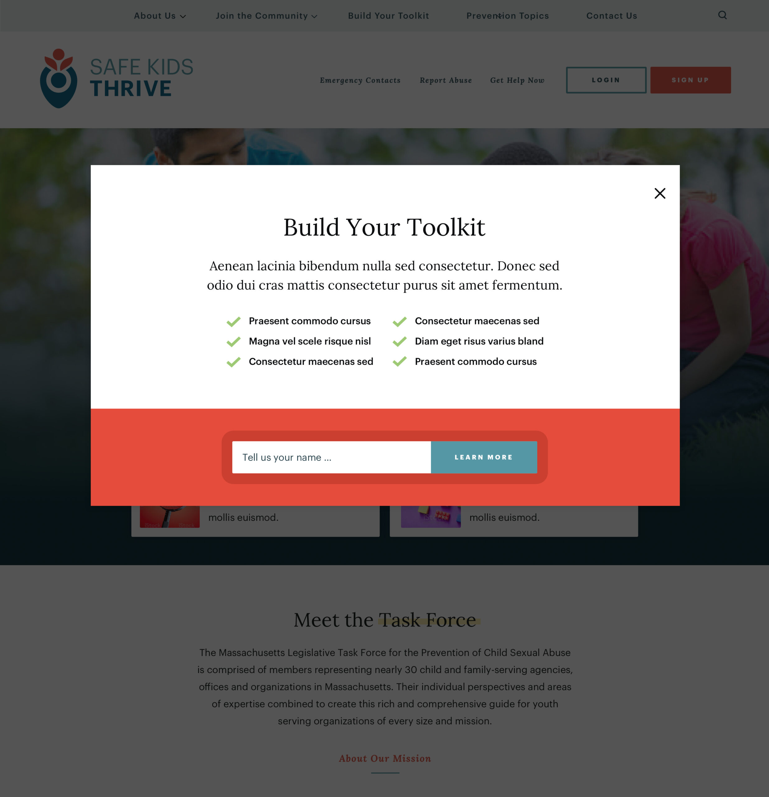
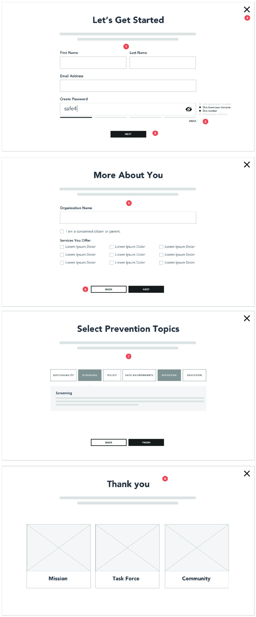
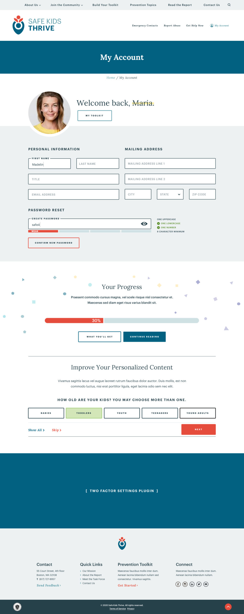
I designed an onboarding wizard that transforms how Youth Serving Organizations engage with child safety protocols. Rather than overwhelming users with a comprehensive report, the wizard uses progressive profiling to identify organizational interests and automatically generates personalized User Toolkits with relevant resources organized into action groups like “What I Should Know” and “Prevention Preparedness.”
The system employs strategic questioning during registration and follow-up modal prompts to refine personalization over time, while seamlessly integrating with Mailchimp for email marketing and Google Analytics for behavioral tracking. This approach converted passive report consumption into active community engagement, providing the Task Force with unprecedented visibility into user needs while delivering tailored action plans that respect each organization’s unique context and capacity.


Wizard, Phase 2
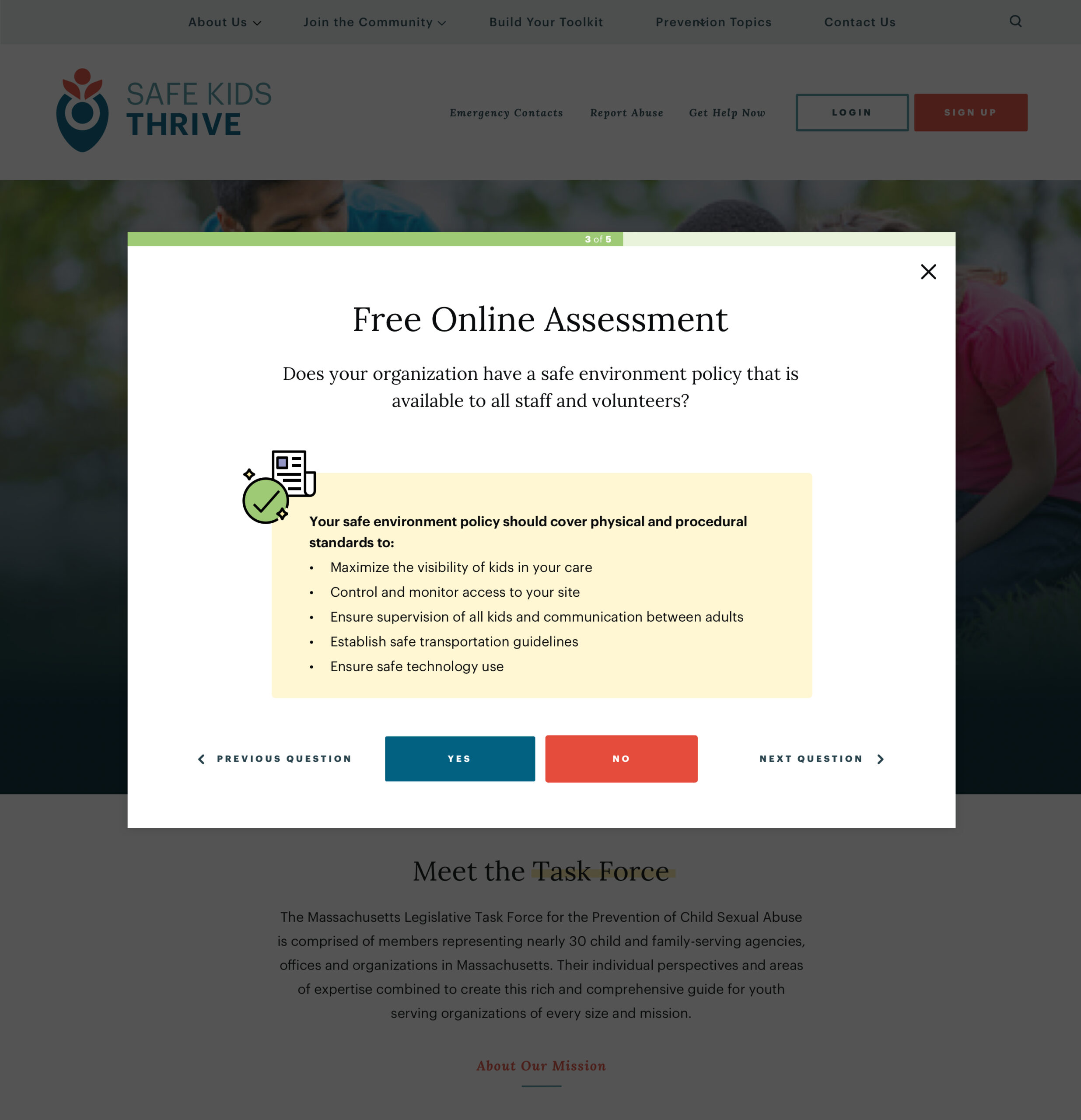
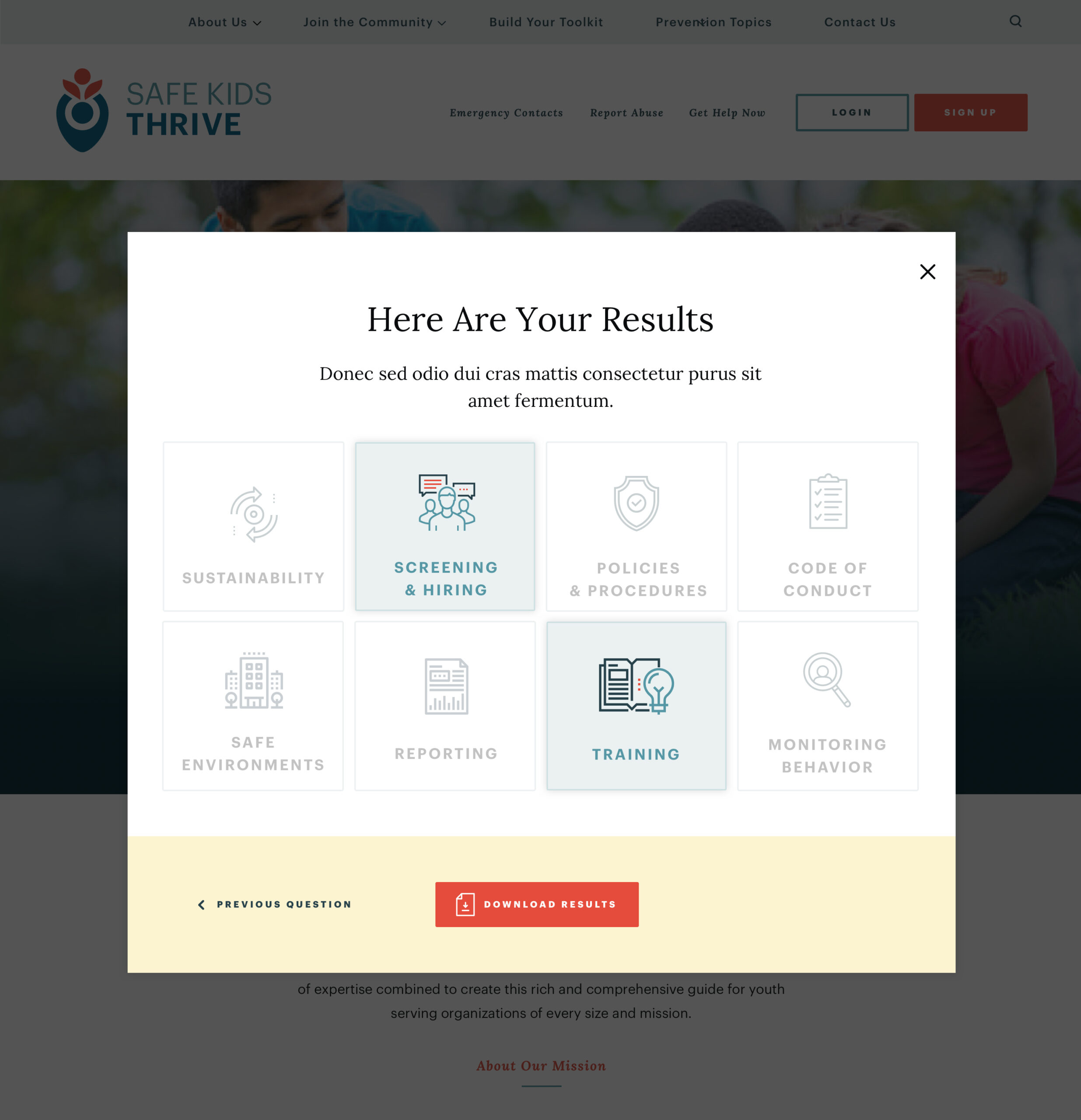
Following the initial launch, I designed a streamlined homepage wizard that provides immediate value to visiting organizations through a quick child safety assessment. The tool guides users through targeted questions and concludes with a personalized results dashboard highlighting their strengths and gaps across key safety domains like Screening & Hiring, Policies & Procedures, and Training.
This frictionless assessment creates an immediate entry point from homepage visitor to engaged user while serving as a natural funnel into the comprehensive toolkit registration.
Brand Guide
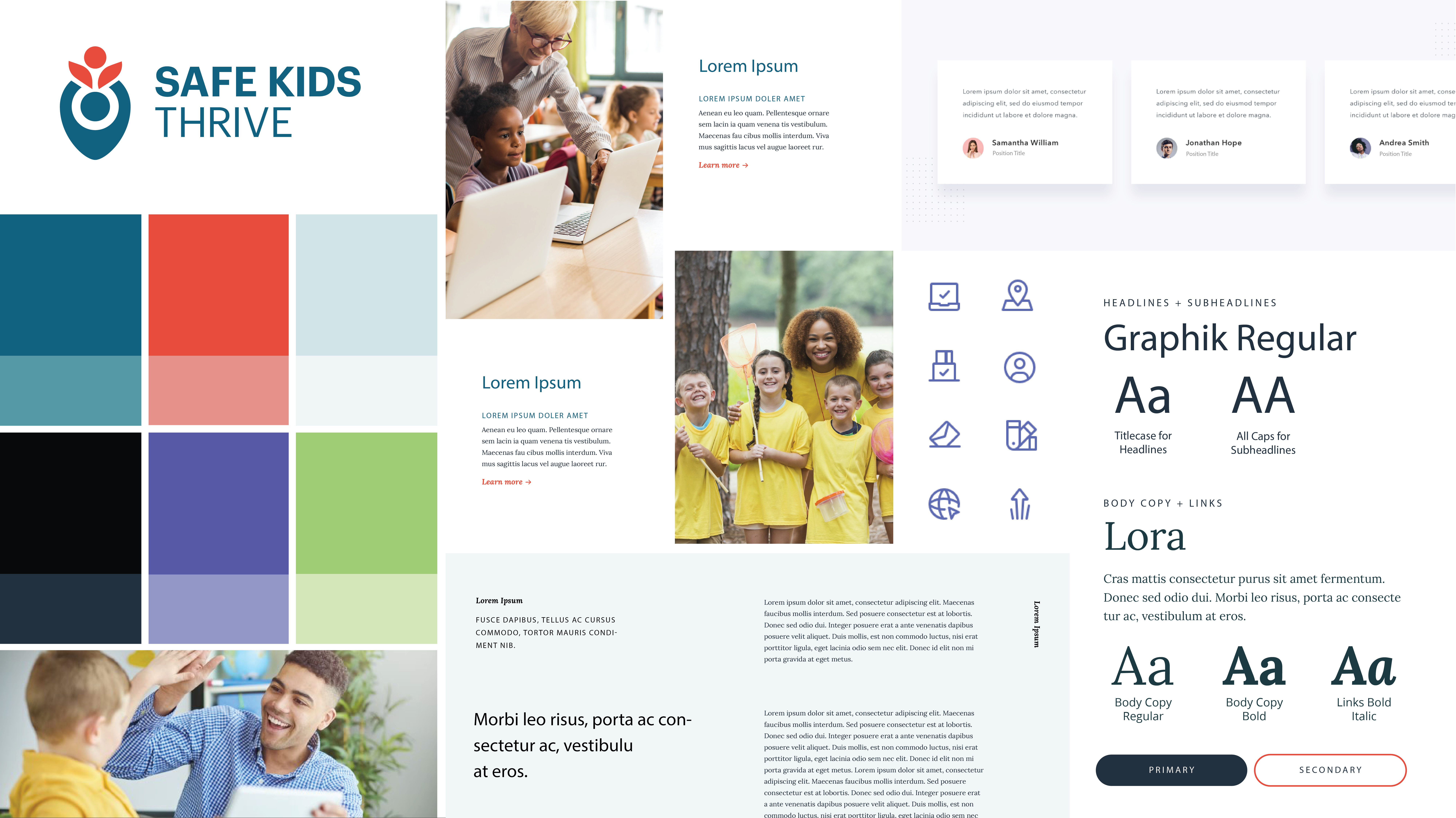
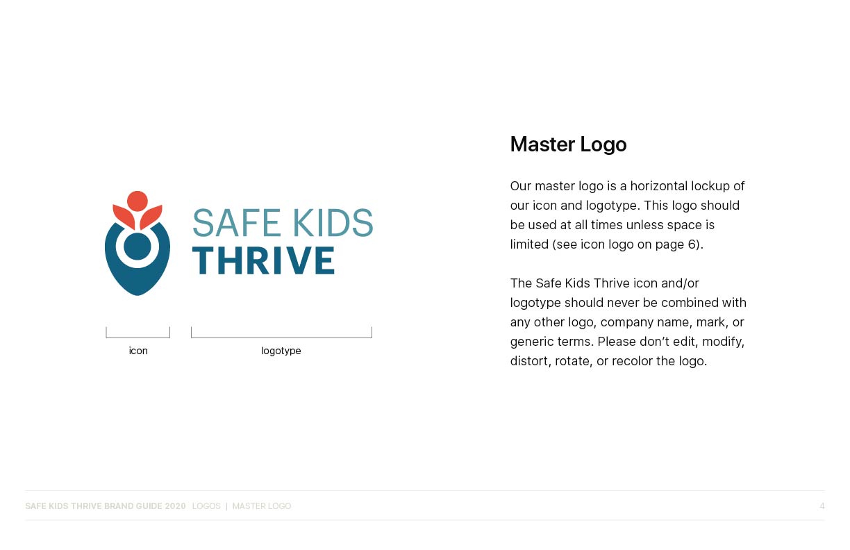
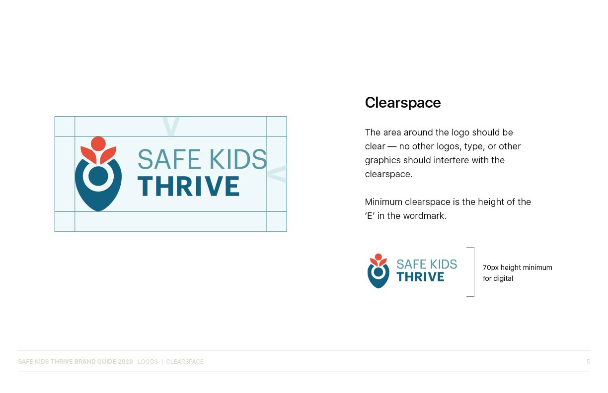
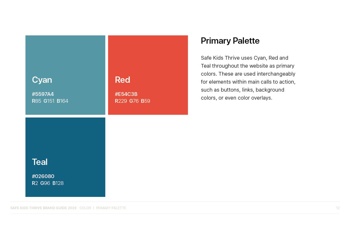
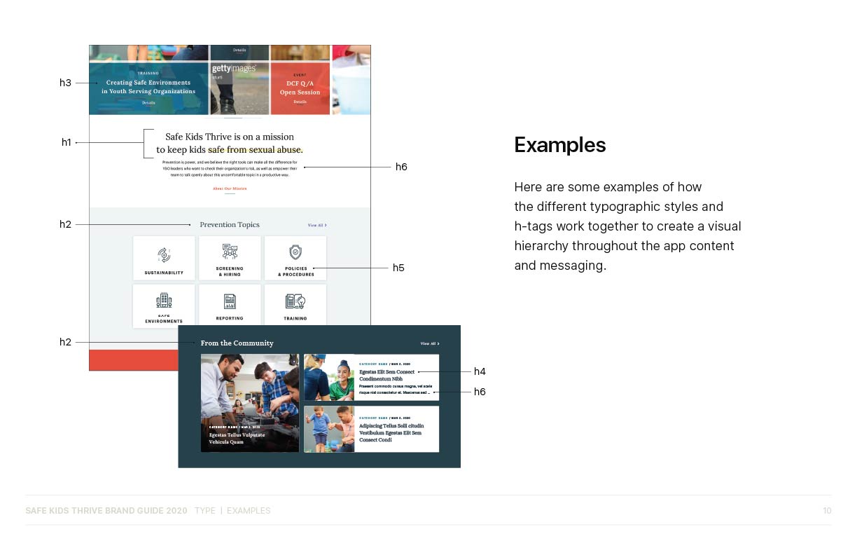
I created a comprehensive digital brand guide that established Safe Kids Thrive’s visual identity system. The brand architecture centers on the existing logo with clean typography and a carefully curated color palette. I developed a dual-typeface system using Lora serif for warmth and accessibility alongside Montserrat sans-serif for digital legibility, creating clear typographic hierarchy across six heading levels.
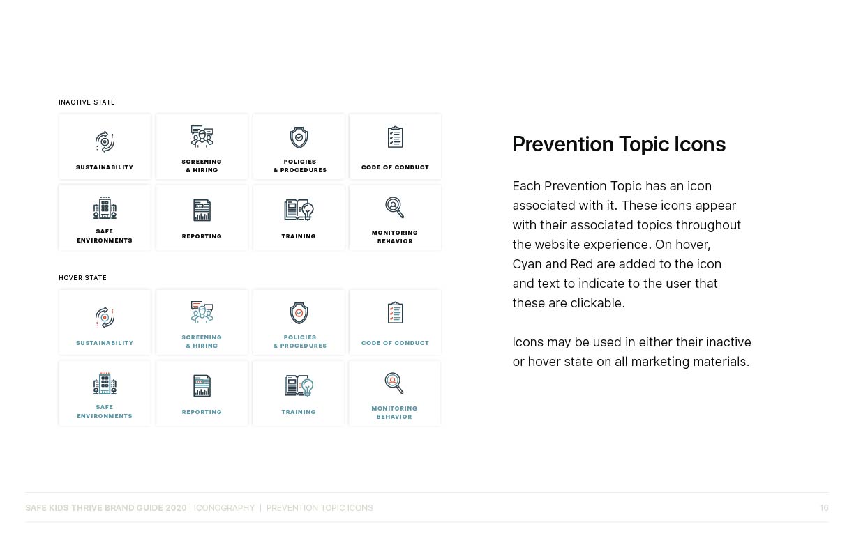
The guide includes a complete iconography system with custom prevention topic icons and interactive hover states, ensuring consistent visual communication throughout the complex user experience. This systematic approach provided the development team with precise specifications while establishing a cohesive brand presence that communicates both professionalism and care.
See the finished experience.
Freelance by design.
Collaborative by nature.
Bonfire Creative, LLC. © 2025
