Honoring Our Father Through Design: The Night Owl Woodworking Logo
Some projects come through clients. Others come from the heart. This one started with family.
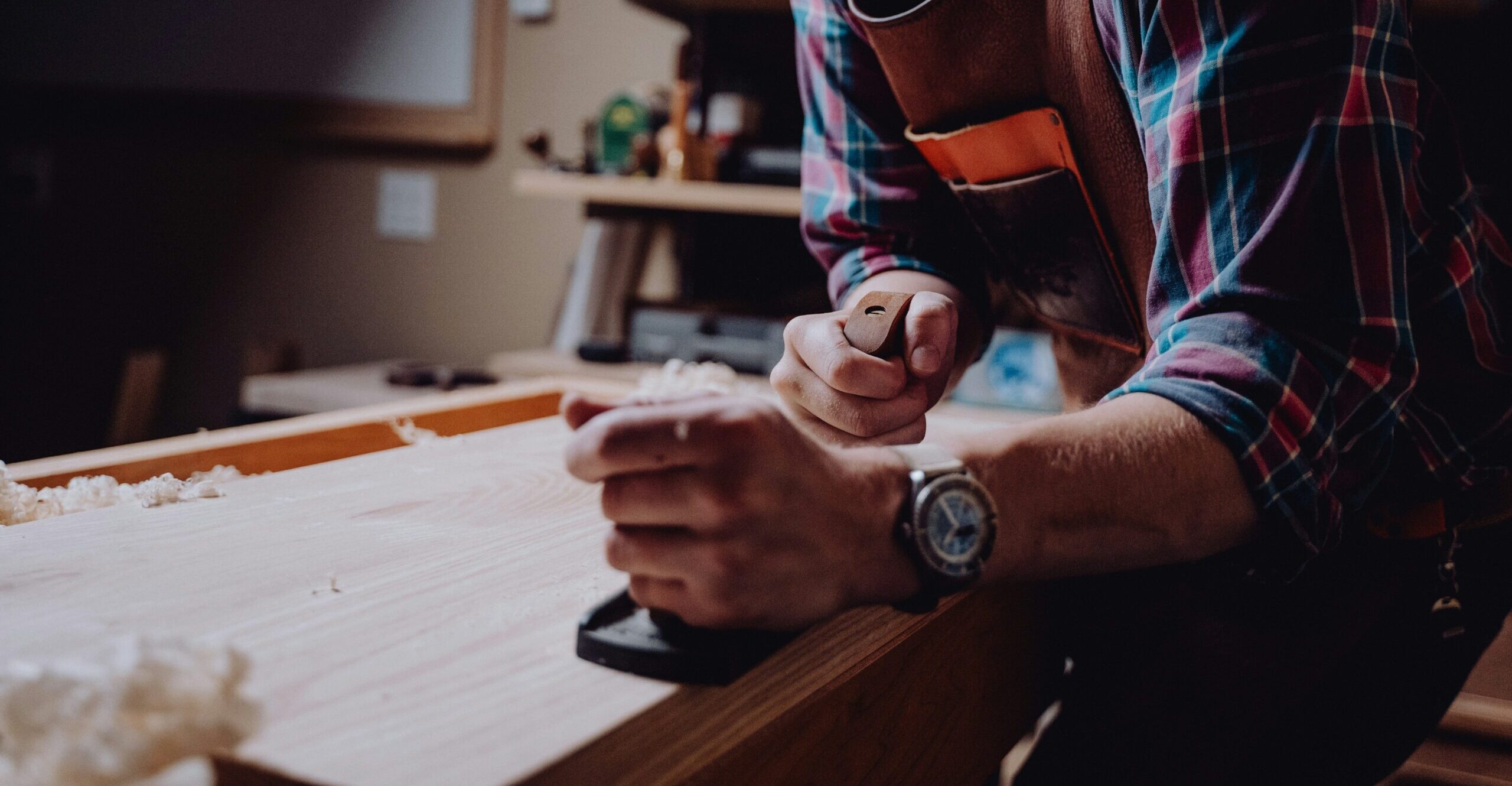
My brother has been quietly building something remarkable with Night Owl Woodworking — a brand born out of long nights in the shop, the smell of cedar, and the same dedication to craft we grew up watching our dad live out every day. Watching it take shape, I wanted to help him take the next step — to give the business a visual identity that matched the quality and heart behind the work.
He didn’t ask me to redesign his logo — I sought it out. I wanted to help him tell his story with the same care he puts into his builds. To give the brand a visual identity that could elevate his business and carry it confidently into its next chapter.
Carrying Forward a Legacy
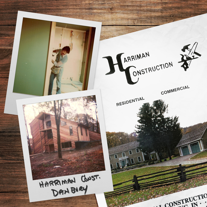
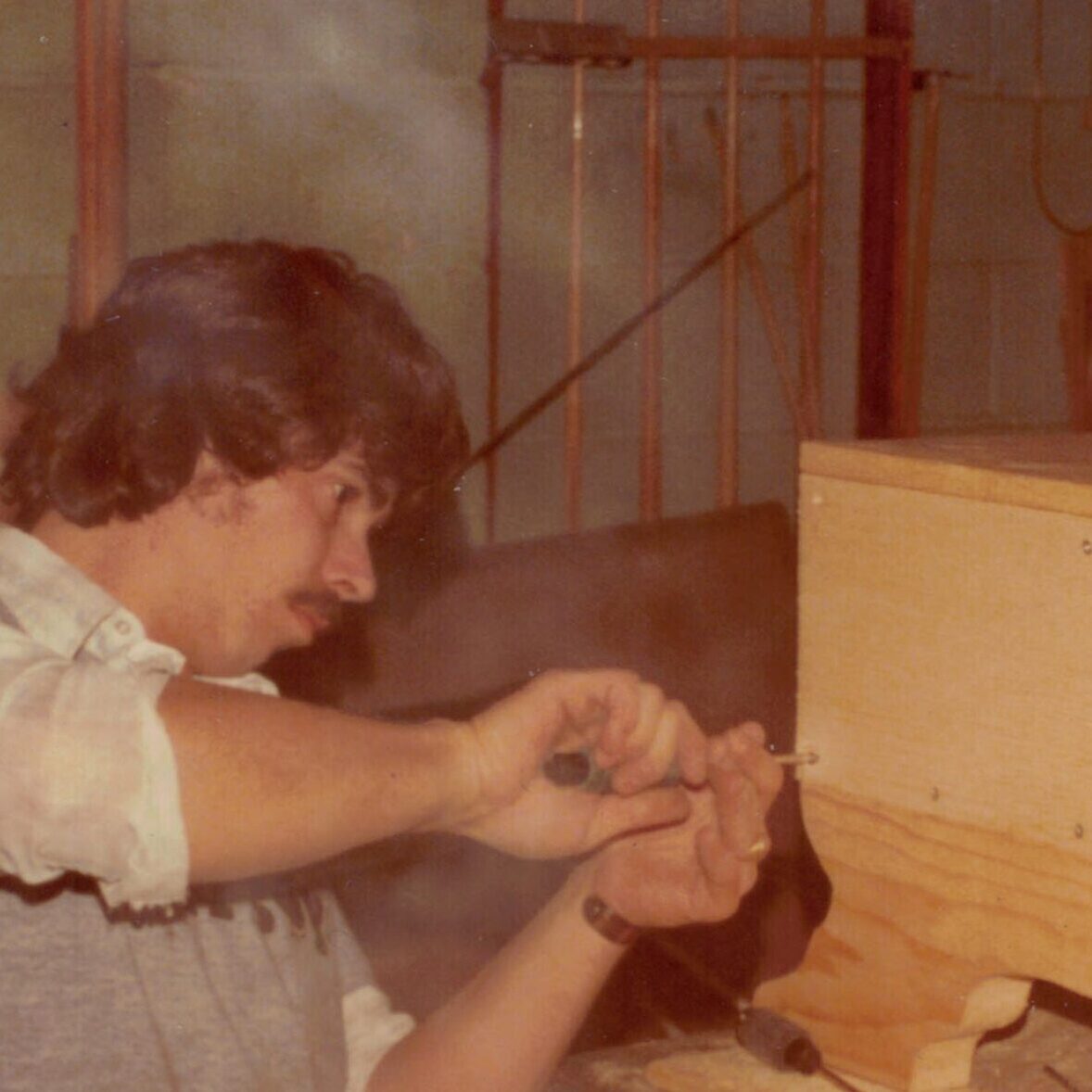
Our dad ran a construction business called Harriman Construction for decades. His logo — simple, bold, and designed by our mom — labeled the side of his vans, every blueprint, every piece of our childhood that smelled like sawdust and fresh lumber. It represented more than a business; it represented the values we were raised with — integrity, reliability, and pride in a job done right.
When my brother launched Night Owl Woodworking a year ago, that spirit naturally followed. A drive to do things right, not fast. A love for the craft itself. So when I began this project, my brother gave me one clear requirement: it had to tie back to Dad’s original Harriman Construction mark. And that was the heartbeat of the brief — honor our father, but design something ready for the next chapter.
The Challenge
Night Owl Woodworking had evolved beyond custom pieces and small projects. The business was expanding into modular cedar structures, refined outdoor designs, and eventually, a full e-commerce presence. The brand needed an identity that reflected that growth — professional and modern, yet deeply personal.
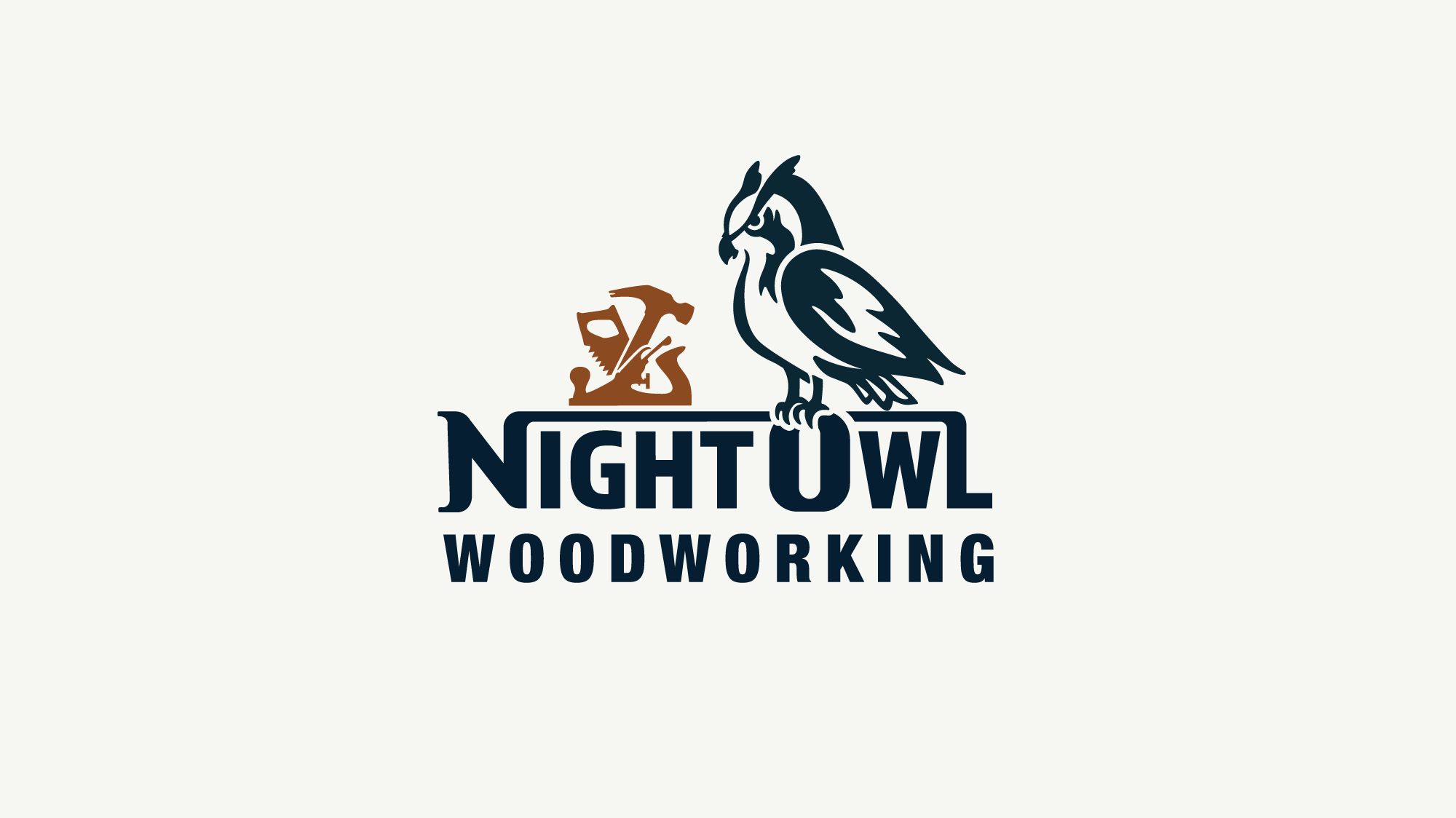
It wasn’t just about designing a logo. So, I started by studying the original Harriman Construction logo. Next, I began sketching ways for the elements of our dad’s logo to live within something new: a mark that felt both handcrafted and forward-looking.
The Process
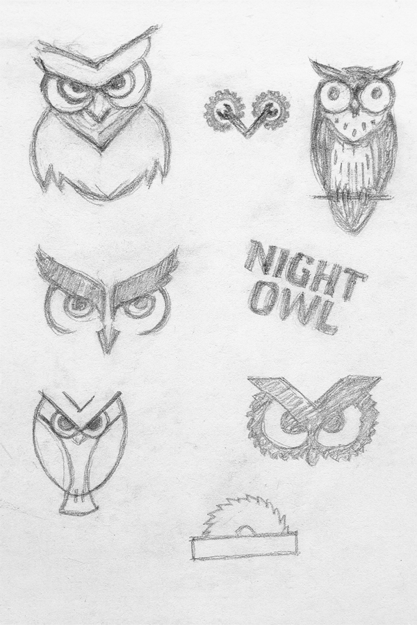
Every logo begins as a conversation between idea and form. For this one, I started where most good design begins — with a pencil and a sketchbook.
I explored dozens of directions, sketching owls, letterforms, and subtle references to the Harriman Construction logo my dad once used. The goal was to capture that sense of grounded craftsmanship — something that could feel at home stamped into wood, printed on paper, or displayed on a screen.
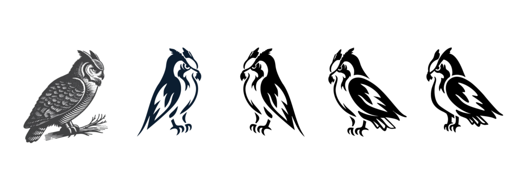
Once the strongest concepts began to take shape, I brought them into the computer for refinement and to explore how the mark could flex across real-world applications. But nothing I’d sketched quite captured the right brand voice. So I stepped back and did more research on owl forms. I studied the angles of feathers, the symmetry of faces, and the ways different species convey character through posture and gaze. That research helped me begin again with fresh clarity and a new sense of direction.
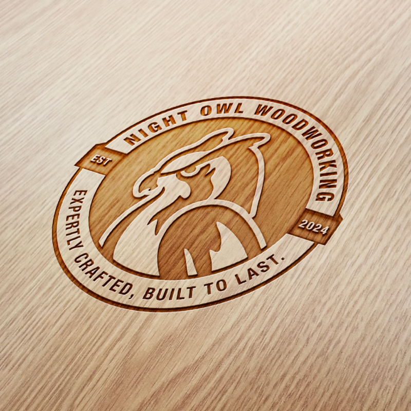
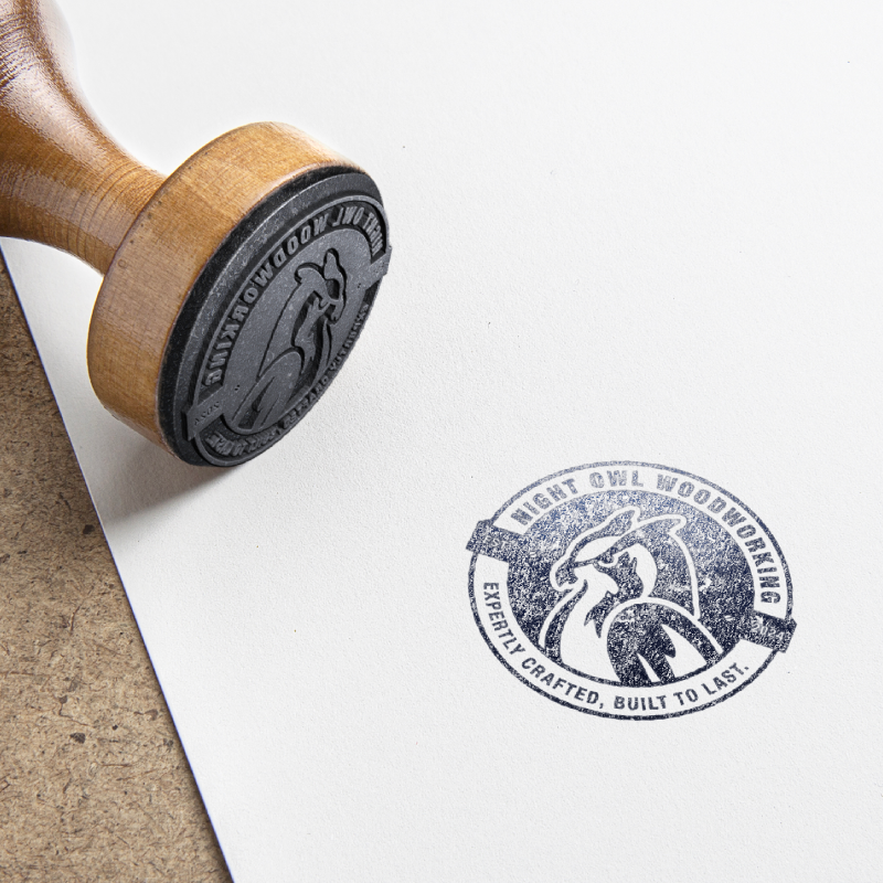
The next phase became about distilling that inspiration into something uniquely Night Owl — an emblem that felt both familiar and distinct, rooted in legacy yet built for what’s next. Below is the progression — from the initial reference photo that sparked the idea to the final vector form that brought it all together.
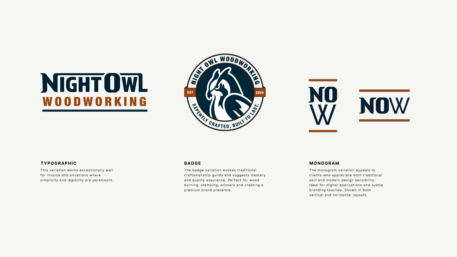
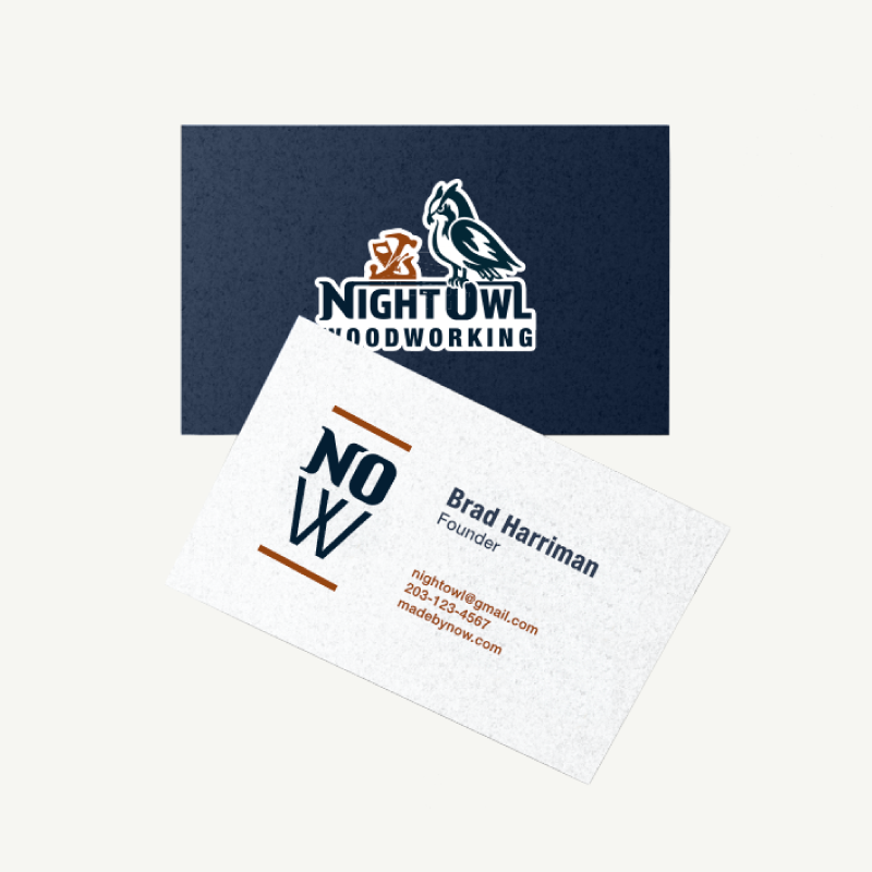
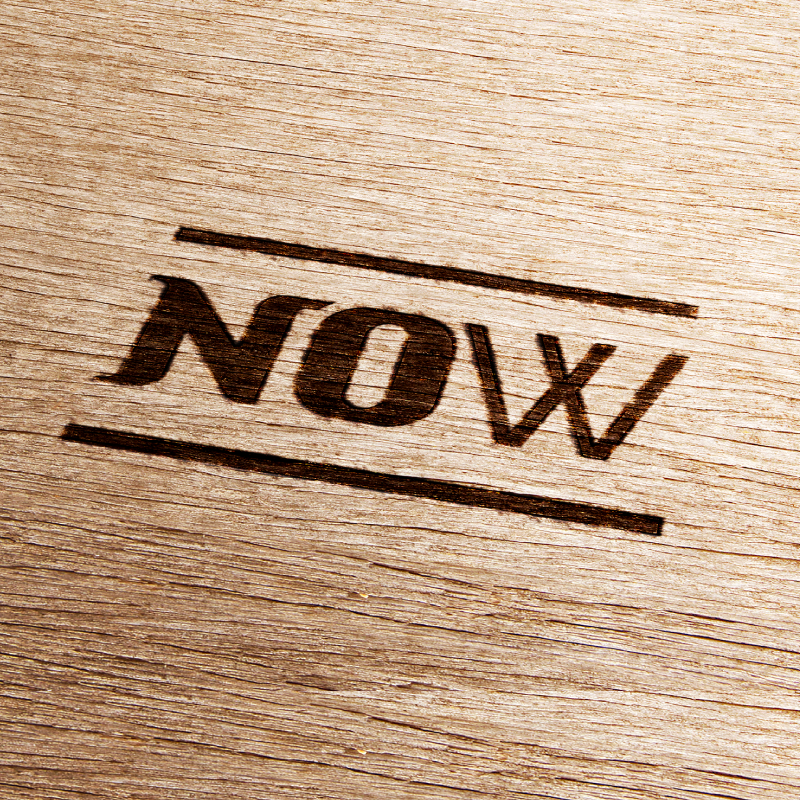
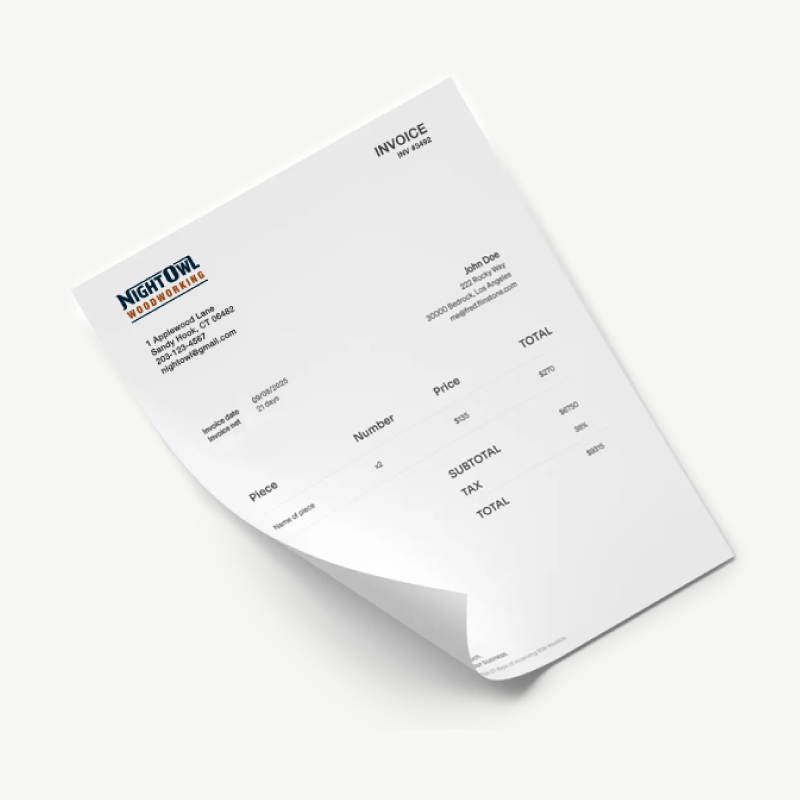
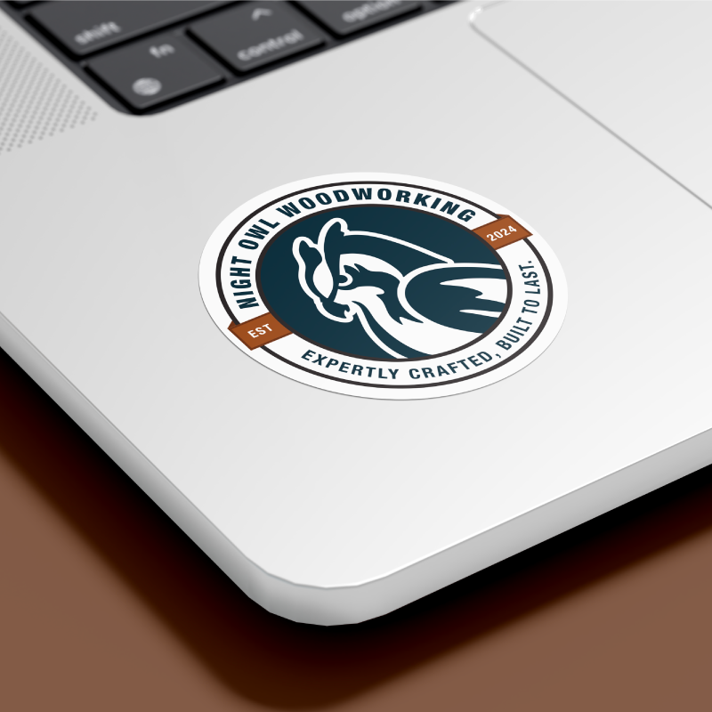
From there, I built out a complete brand identity system — including a primary logo, a typographic solution, a circular badge, and a simplified monogram option designed for smaller spaces and product branding.
Each piece was designed with versatility in mind:
• Paper: Business cards, invoices, and stickers
• Wood: Engravings, product stamps, and signage
• Web: The future Night Owl website and social platforms
The Result
The result is a cohesive, flexible system that looks just as strong laser-engraved into cedar as it does centered on a digital storefront. The primary mark feels like the natural evolution of a family trade — timeless, balanced, and grounded in story. In addition, it honors the legacy of Harriman Construction, while giving Night Owl Woodworking a brand identity that’s distinctly its own. Next, I’ll be designing the Night Owl Woodworking website, where that story will come to life through e-commerce — showcasing handcrafted pieces, modular structures, and downloadable woodworking plans for makers everywhere.
In the meantime, you can follow Night Owl Woodworking on social to stay connected:
A Closing Reflection
This project wasn’t just about design — it was about family, craft, and carrying forward something that mattered. Creating the new Night Owl Woodworking logo gave me the chance to honor our dad and help my brother’s business step into its next chapter with confidence.
So, if you’re building something that matters — whether it’s a brand, a business, or a legacy of your own — I’d love to help you bring it to life through thoughtful, story-driven design. Please reach out if you’re looking for brand design, logo development, or website design that tells your story with meaning and momentum.