
What Happens When UX Leads the System, Not the Screens
When a global healthcare organization set out to modernize its Universal Patient Language (UPL) website, the challenge wasn’t visual polish. It was clarity at scale.
In collaboration with The Grovery, I led the UX architecture and design work for a large, multi-stakeholder content platform built to support internal teams, global partners, and regulated communications. The existing site had grown organically over time. With nearly 80 pages, inconsistent structure, and deeply nested navigation, users were struggling to find the tools and guidance they needed to do their work efficiently.
Our goal was simple—but not easy: Create a streamlined, scalable experience that makes critical resources easier to find, easier to maintain, and easier to grow.
The Problem
Too much content, not enough structure
The site supported a wide range of use cases—from standards and rules documentation to real-world applications and implementation guidance. However, the information architecture had never been re-evaluated holistically. Key challenges included:
- Excessive clicks to reach high-value content
- Redundant and outdated pages
- Navigation items that did not reflect real user intent
- Important sections buried deep in the hierarchy
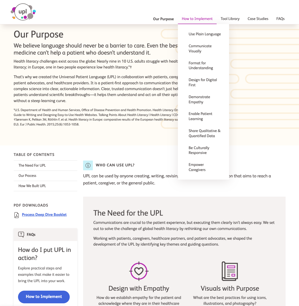
Three content areas were consistently identified as high-priority but underperforming:
- A tool library containing rules, guidance, and downloadable assets
- Case studies that show how UPL is applied in real work
- A “learn and apply” experience meant to support onboarding and day-to-day usage
My Role
Leading UX architecture, user flows, and system design for a complex, regulated platform
As the UX and design lead, I partnered closely with The Grovery to:
- Audit the full site structure
- Design a new, simplified sitemap
- Define reusable page templates
- Create AEM-compatible wireframes
- Establish scalable layout and component patterns for long-term growth
The project began with a dedicated UX architecture phase focused entirely on structure, hierarchy, and content flow before any visual execution was finalized.
Designing within real platform constraints
A key requirement was that all designs had to be compatible with the organization’s proprietary site-building platform built on Adobe Experience Manager (AEM), using a constrained set of predefined components. Rather than designing freely and retrofitting later, I intentionally designed within those constraints from the start:
- Mapping existing platform components (accordions, carousels, multi-column layouts, and content modules)
- Establishing layout rules that could be reliably reproduced by internal development teams
- Structuring wireframes to reflect real editorial and authoring workflows
This ensured that the resulting designs were not only usable for end users—but also practical and maintainable for the teams responsible for publishing and governance.
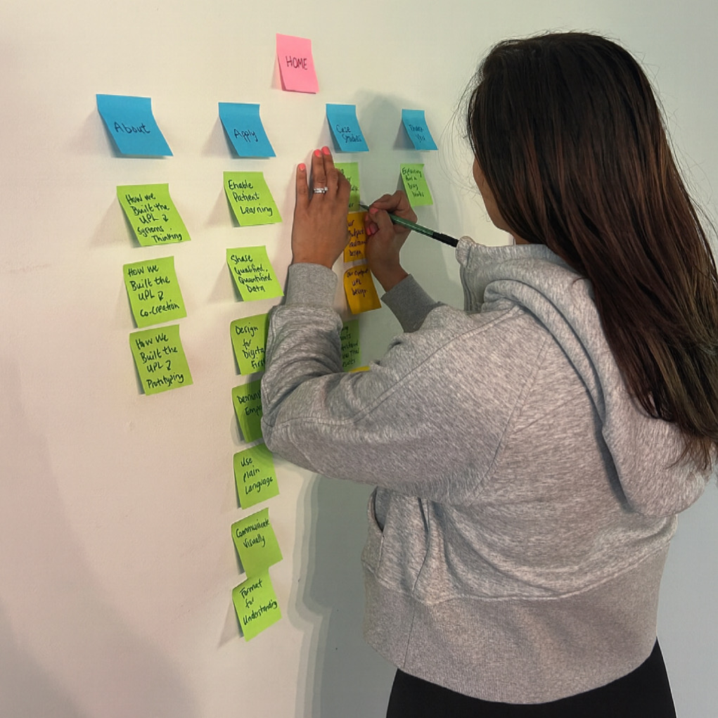
From content sprawl to an intentional system
The first major milestone was a complete information architecture overhaul. Through a detailed content audit, I reduced and reorganized the site into a cleaner, more user-driven structure. The new sitemap focused on:
- Clear content groupings
- Logical page hierarchy
- Fewer steps to reach critical resources
- Flexible templates that could scale with future content
The outcome was a simplified, documented UX foundation designed to guide future design and development phases.
Mapping real user behavior with authenticated and unauthenticated flows
In addition to the sitemap and page templates, I created detailed user flow maps to model how different users move through the platform before and after authentication. The flows document how users enter the experience, register or log in, recover credentials, and transition between high-value areas such as implementation guidance, case studies, and the tool library. Separate paths were defined for unauthenticated and authenticated users to reflect real access rules and content availability, including gated downloads and role-based entry points.
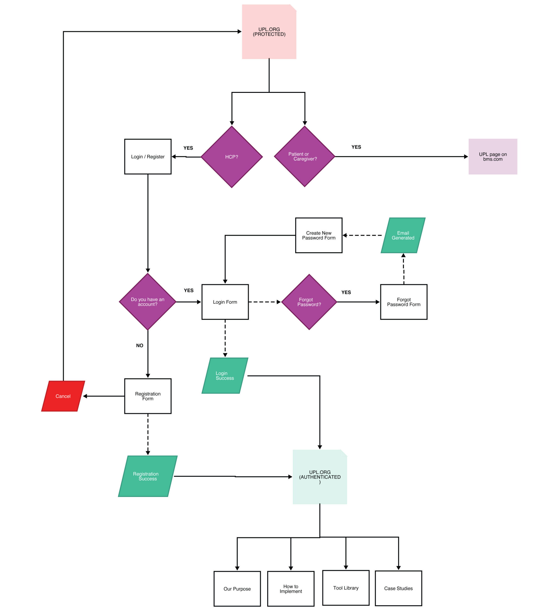
By visualizing these flows alongside the information architecture, we were able to validate navigation decisions, identify friction points in registration and access, and ensure that key resources remained discoverable at every stage of the user journey—without relying on redundant navigation or buried links. This flow mapping became a critical bridge between UX strategy and platform implementation, helping internal teams clearly understand how users progress through the system in both public and logged-in contexts.
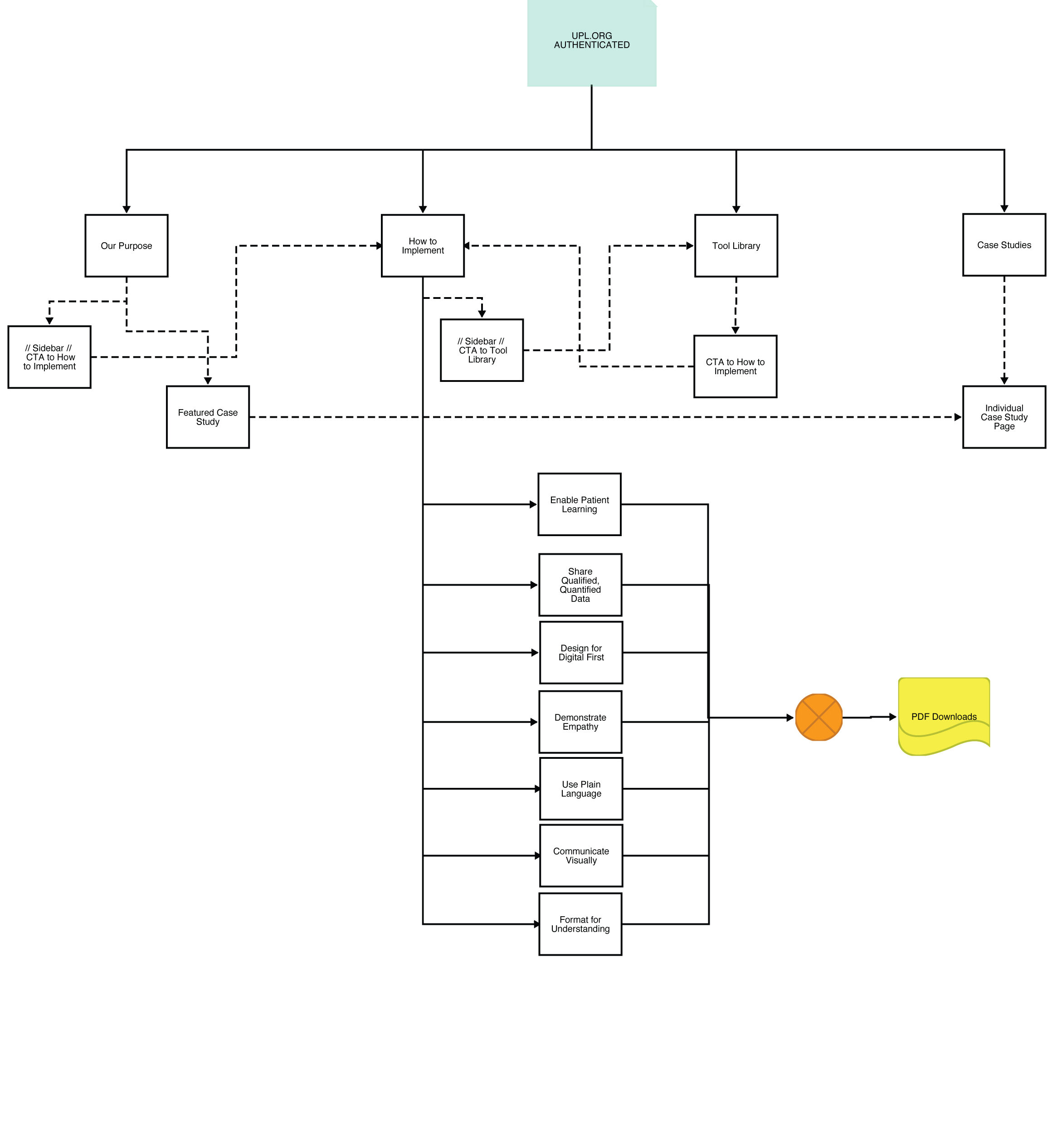
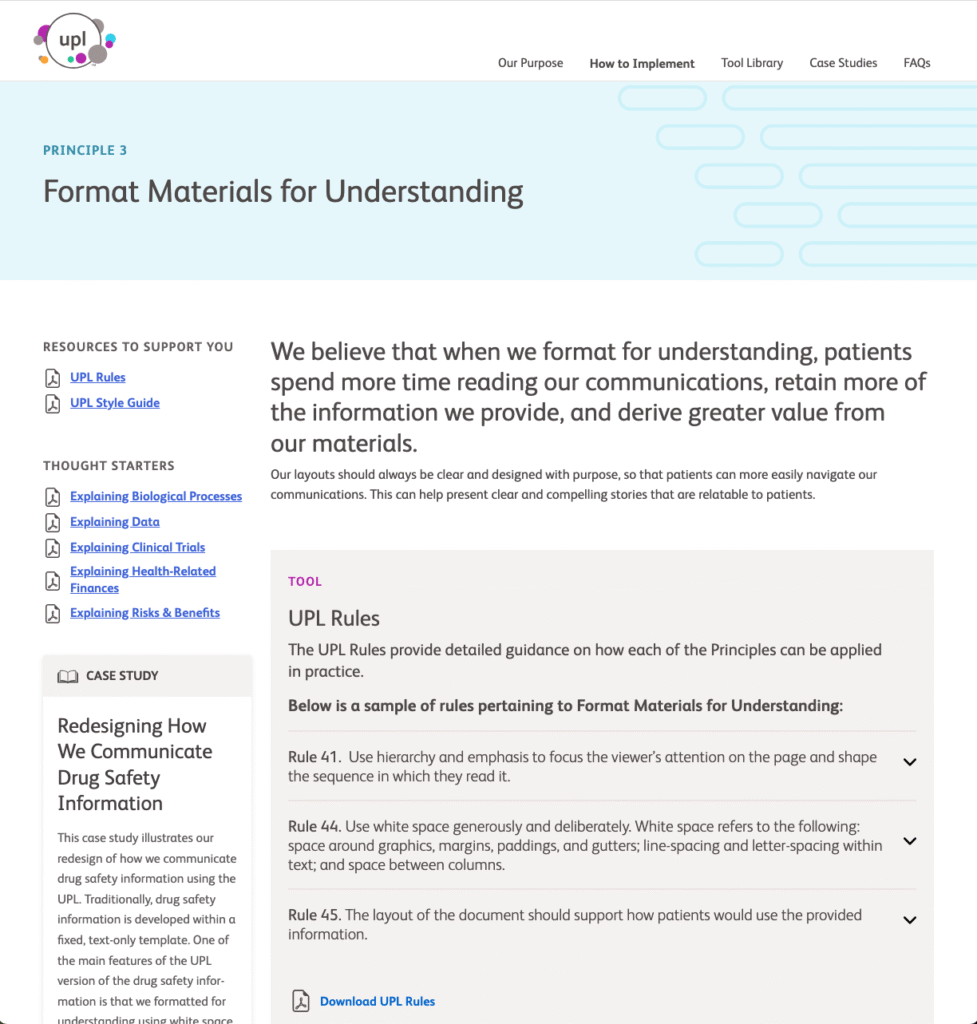
Wireframes designed for reuse, not just presentation
Rather than creating page-by-page layouts, I developed a library of reusable wireframe templates representing the full site ecosystem.
These templates were designed to support:
- Standards and principles content
- Tool and resource libraries
- Case study overviews and detail pages
- Educational and implementation workflows
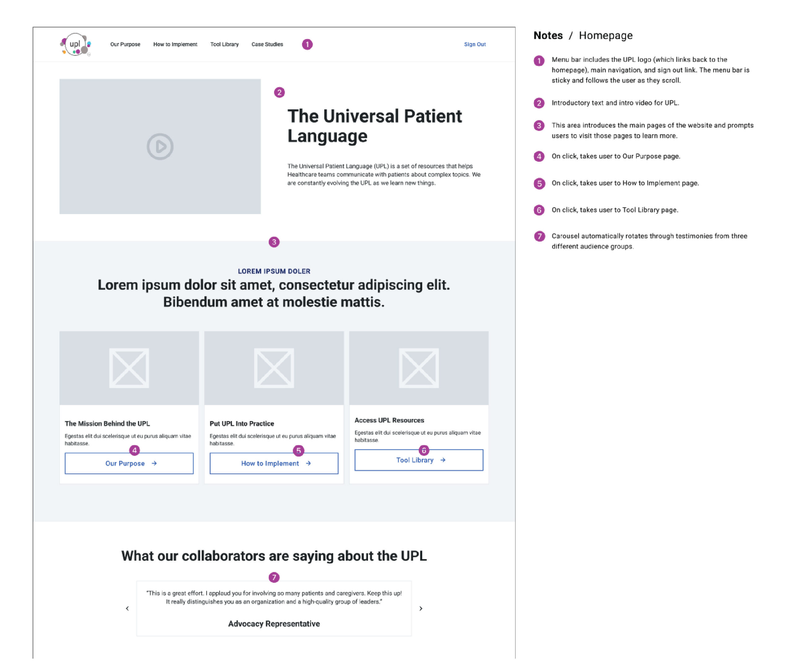
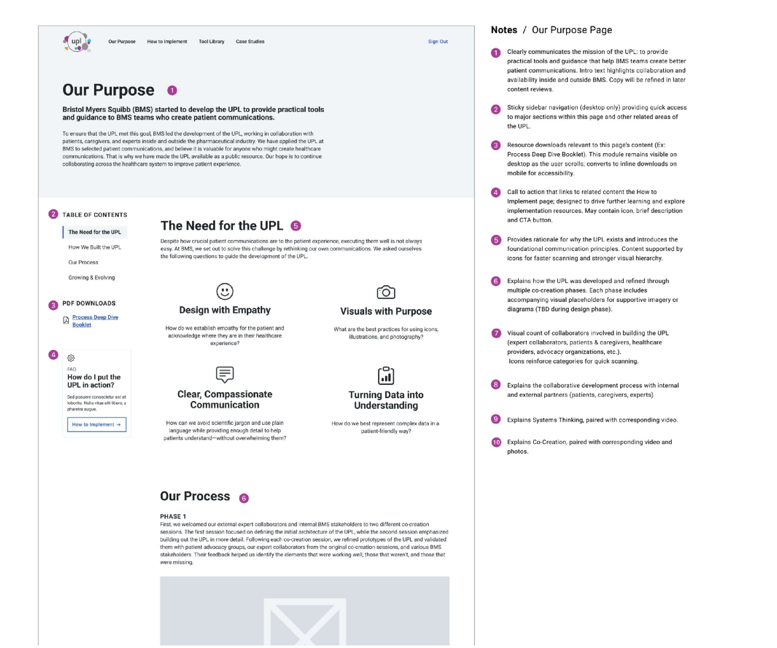
Each wireframe included functional annotations to clarify:
- Content hierarchy
- Component behavior
- Editorial expectations
- Platform limitations
This enabled faster internal reviews and smoother handoff to design and development teams.
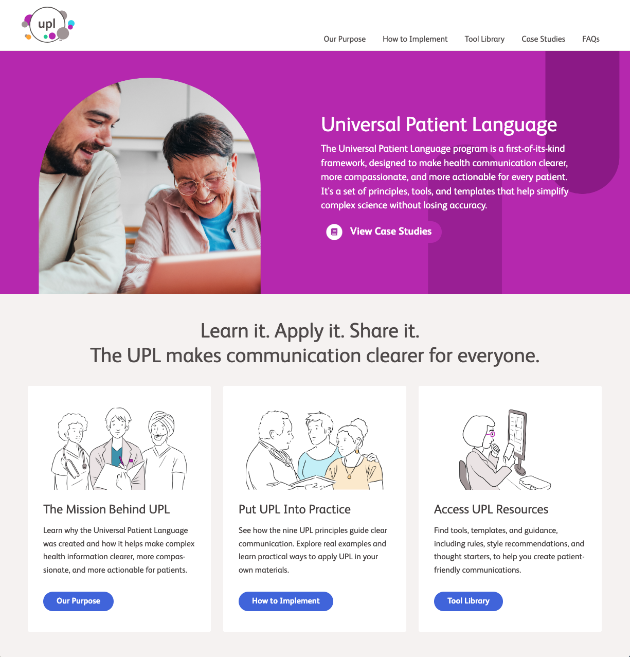
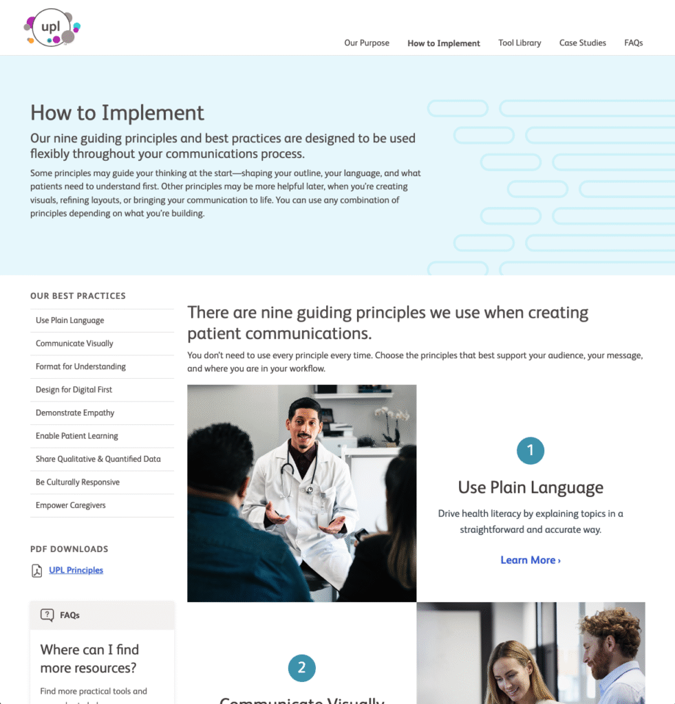
Expanding into high-fidelity design
Following approval of the UX foundation, the project expanded to include high-fidelity desktop templates and page designs.
I created a full set of reusable layouts including:
- Principle and standards detail pages
- Tool library layouts
- Case study overview and detail templates
- Multiple real-world case study pages built on a unified system
All designs were delivered in Figma, aligned to the established design system, and prepared for developer handoff.
Why this project mattered
This project is a strong example of how thoughtful UX architecture becomes the backbone of sustainable digital systems—especially in regulated, content-heavy environments. By focusing first on structure, governance, and platform realities, we created a foundation that supports:
- Global accessibility
- Easier internal maintenance
- Consistent authoring experiences
- Long-term scalability
Most importantly, the final experience enables teams to spend less time searching for information—and more time applying it.
Project type: UX architecture, information design, and system-driven web design
Collaboration: The Grovery
Role: UX strategy, IA, wireframes, and high-fidelity design
Platform: Enterprise CMS environment (AEM-based)
Note: This case study intentionally omits client branding and live URLs in accordance with confidentiality requirements.